I’m working on a new OSM recruitment poster, and would like feedback/suggestions.
Too many words, it’s good information but my eyes slid off the page.
That said, I really appreciate the work and I love the idea, I’m just very blunt with feedback lol
6 Likes
I like it, but would continue working on it. Try a little more margin between the text and the box, and a bit more space between the boxes, and if it doesn’t fit, see if you can densify the text.
I would put the rounded corners either on all boxes or on none or distinguish them by the corner and other aspects (font, size/weight/family, colors, layout), at least the two yellow boxes do not work for me as they are different kind of boxes.
2 Likes
The coloured backgrounds for the text make for difficult reading, especially nearer the bottom of the orange boxes where the background is darker. Personally, I would only read a short way into the box, maybe the top paragraph then give up. If you have to have text on coloured backgrounds there are many websites to help pick good readability backgrounds.
3 Likes
What’s the target print size?
I would remove the any use of gradients, they print poorly with most poster processes. I’d also avoid the tape around the middle bubble, and move the QR closer to the “scan the QR code” text.
3 Likes
The target print size is 8 1/2 x 11.
I’m not planning to do anything special, just use a normal printer, and standard paper.
Also, I was hoping for some advice on how to slim down the text, like which sections to remove or replace.
I know that it is too long for most people to read, and was hoping to get some help with that.
1 Like
Well, I was hoping it would be eye catching.
1 Like
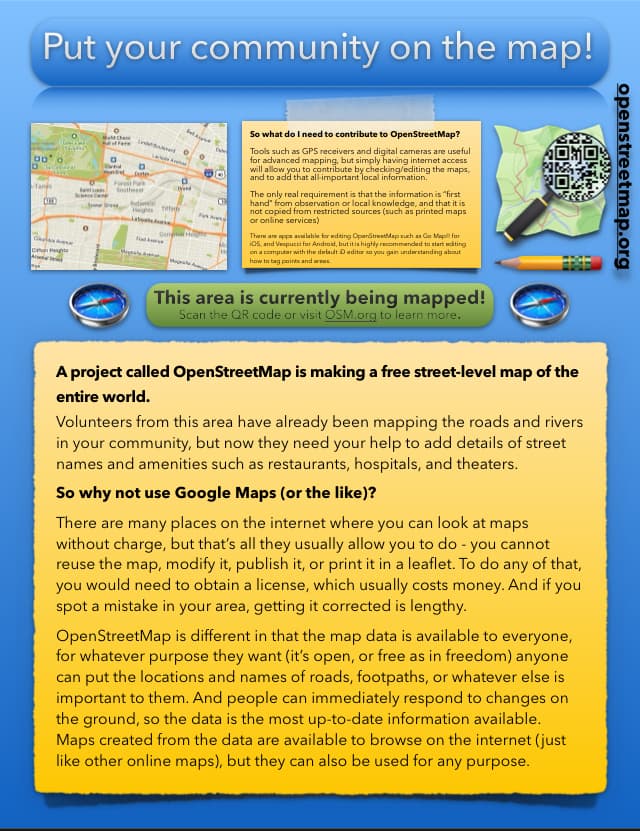
So, how does the last picture look?
It’s much better now, the gradient background round corner bars do not convince me yet, the blue one is melting together with the background on the top and the green one seems squeezed. I’d make it larger, with more margin from text to box. And slightly more margin between the boxes as well. Think about the shape of the free space, you do not have to fill every square centimeter.
2 Likes
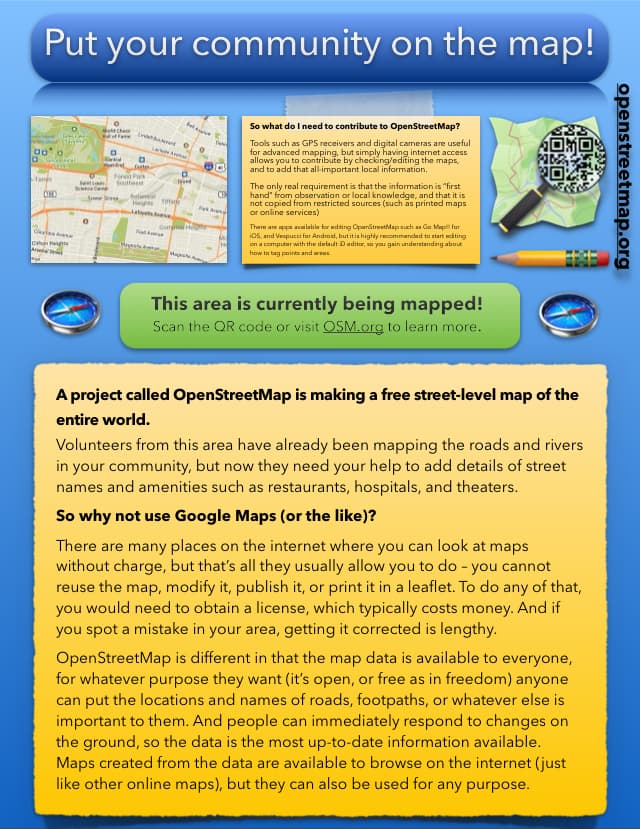
How can I condense the text?
Hi @CatSu
Setting aside the design, I would suggest you ask yourself a few questions first:
- Who is the target audience? How tech-savvy are they?
- What’s the target medium? (online, printed…)
- What do you want to get as a result of people reading it? What are the expected actions you want people to make?
- What are the incentives for people to engage in your call to action? Why should they care? What’s the right call to action for that?
- Where people can talk with others about this in case they have questions?
With this information written down you can now start thinking about the “How”, including a poster design and text.
Let’s say you want to engage with people on the streets to help you improve the map of your neighborhood and you want to engage the people passing by a crowded area of your neighborhood.
I would try to limit the scope of your call to action. “Help map all trash cans in the area” vs “get involved with OSM”.
Incentives: Why people should care about helping mapping all trash cans? Maybe there is a waste problem in your area and people are tired of it? Use that as the main incentive in your comms.
Example:
Let’s stop wastes in our neighborhood today!
Join other people like you and help putting all trash can locations in a map to help bring a shared complain to the local Town Hall.
Just scan the QR for instructions on how to help.
You can also join the neighborhood mapping group chat over short.url/chat
In this case you would need a super simple instructions for people to download an app like OrganicMaps and quick 1-2-3 instructions on how to create an OSM account and add trash cans to the map (maybe a nice video). So anyone without any previous technical knowledge can make it.
Also you will need to set up a chat room using apps that are popular in your country to get people join, ask questions and socialize, even provide some peer-support.
Helping solve a local problem is a good excuse to get people interested in open mapping and maybe keep being engaged in the future improving other parts of the map or even helping others get on boarded.
I hope these ideas are useful for you.
Cheers.
1 Like
Well, at first I didn’t think about that, I just wanted to update the old poster, and make it easier to read, but I’ll keep your ideas in mind.
This might be helpful in areas where addresses are sparse, but I don’t know how to sell people on the idea that OSM is better, but it’s missing hundreds of addresses.
I would say that you’ll need to find an incentive for people to join and help with missing addresses. That audience is probably different from the regular user, who won’t want to use something with data missing.
Alternatively you can think about if there are local orgs (local gov?) who already have this data and want to collaborate to get it into the map (though bringing them OSM skills or helping to port the data to the map from the local mapping community).
1 Like
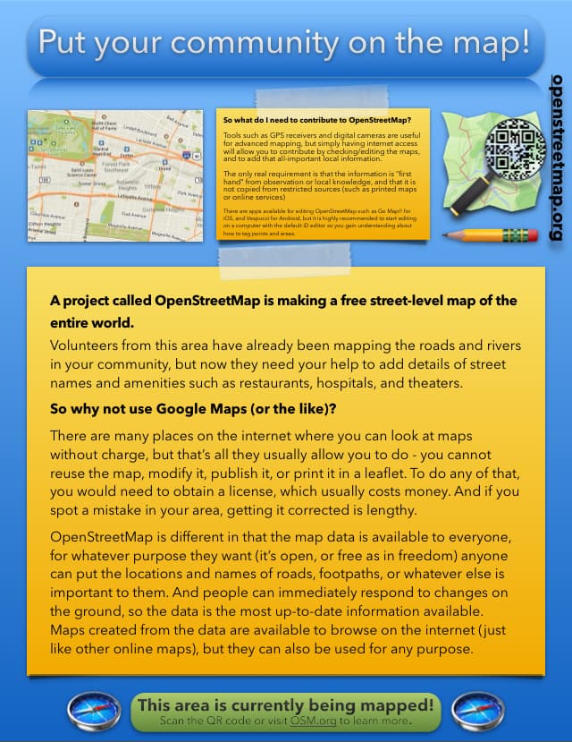
It’s looking better, but I’d remove the “so what do I need” sticky note and just direct people to a specific webpage that describes how to contribute. At the very least, “what do I need” shouldn’t be the first text on the page after the heading, information needs to be ordered from most general and interest-grabbing to most specific and actionable.
Secondly, “this area is currently being mapped” makes me wonder if government drones are looking at me. You might consider another friendlier call to action headline like “join your neighbors in creating a Google Maps alternative.”
Finally, as others have said the main text is long, wordy, and techie. Pretend you’re describing the project to a random 70 year old or 13 year old in an elevator and you have 15 seconds to get out the most important interesting bits. That’s the language you should use, 99% of people don’t care about “licensing” or “spotting and correcting mistakes” or “responding to changes on the ground.” (I for one have told Google of many mistakes and it takes far less of my time to do so than editing OSM myself. Lengthiness of mistake-fixing isn’t an OSM feature to non-nerds.) Average people do however like avoiding giant corporations, hiking/bicycling, getting together with likeminded neighbors who care about their community, finding free things to do outdoors, not paying money for things, exploring new places, etc etc etc. I’d save this as Draft A and open a blank text editor and write out a Draft B of this friendlier description. I’d also consider leaving a space open for local orgs to place their own contact info, i.e. Slack or Meetup links where someone can get involved directly. Filling the entire page with text is probably not the best.
2 Likes
For the “why not use Google maps” section maybe you could get some feedback from your target audience before deciding on the final text.
For example, I often see the same argument you make about not being able to use Google maps / needing a licence but I’m not sure many people care. Yes big businesses will care, yes the open source community care, but do others? From the number of screenshots of Google maps I see on leaflets, posters etc from small businesses such as restaurants, cafes, mechanics and so on, I think most don’t care. These people may engage with a different argument instead such as locals being in control of their own map and not needing to wait for Google to eventually update. Being able to map what matters to locals rather than what Google think matters.
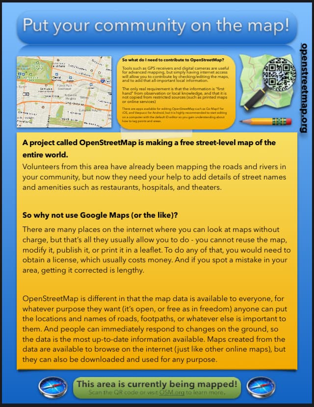
In the “what do I need” section you start with the advanced parts (GPS receiver) before then introducing the basics. This may put people off immediately. Why not start with the basics and follow up with the advanced? Also, depending on the target audience, you might just want to say “smartphones” instead of “GPS receivers and digital cameras”. I don’t think I’ve used either of those standalone items for nearly 10 years. Doubt many people have a separate digital camera these days.
Finally, on style, have you tried just putting “Put your community on the map!” in plain text (maybe black) without the blue oval shape or drop shadow effect? These effects feel dated to me - they remind me of Windows XP! (But your audience may not share my opinion so best to check)
OSM United Kingdom (local chapter) made 5 leaflets in A5 size. Big eye-catching image and logo on one side, text based on a theme (e.g. photo mapping) on the other. Feel free to have a look at what we did and borrow any ideas you like.
Anyone in the UK can also use that link to order some (we ship to UK addresses).
2 Likes