I entirely agree with you.
That’s a good point.
I was hoping I didn’t have to do a complete redesign, but oh well.
I entirely agree with you.
That’s a good point.
I was hoping I didn’t have to do a complete redesign, but oh well.
How’s the poster looking?
Miscellaneous thoughts:
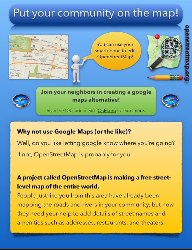
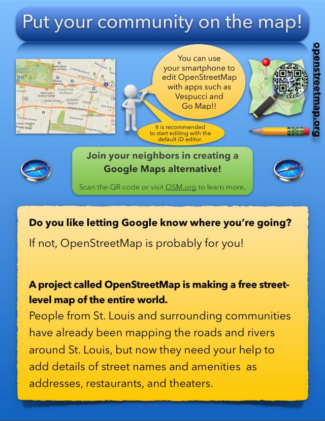
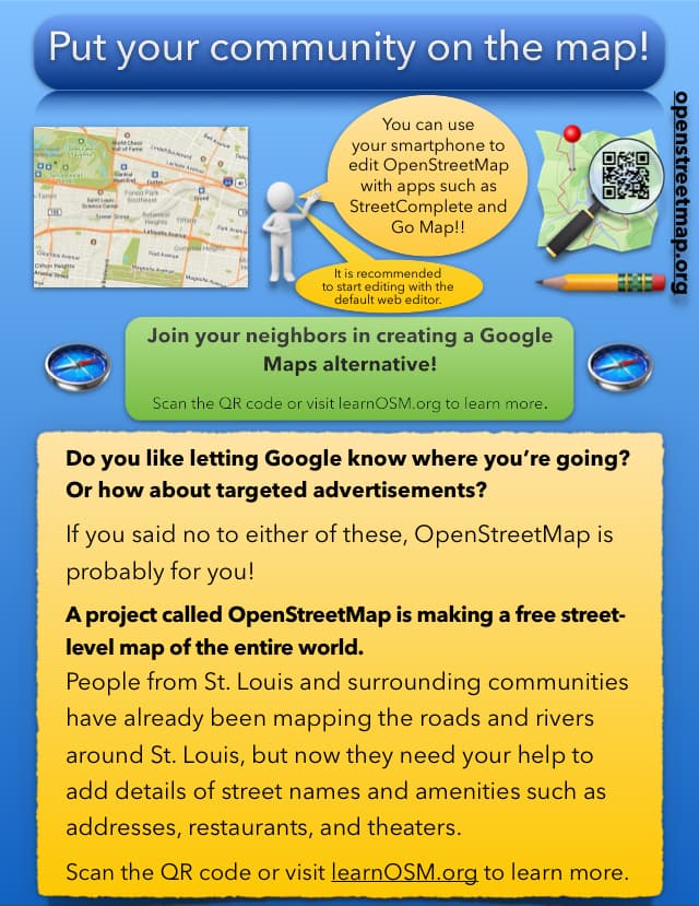
As for the visual design: It does have telltale signs of being made by a hobbyist rather than a professional marketing company, such as the mix of styles and the “clipart” graphics. But I don’t think that prevents the poster from being effective.
there is for example LearnOSM
or Beginners' guide - OpenStreetMap Wiki
generally wiki.osm.org is a better link to give, and there is a prominent link from the wiki to the map, these days the link from the map to the wiki has the least possibile prominence, it’s right after a nineties style list of mailing lists, irc, switch2osm information and the welcome mat for organizations
The thing about google is not only that they get to know where you go, but that you get a map that is biased by advertisement.
I know many people who don’t care about privacy or who believe they can’t prevent being “spied at” anyway, so these considerations don’t influence their behavior. Nothing to hide etc, but getting a map that is worse for their purpose than it could be, just because someone paid to have an advantage over organic rating and importance, maybe can convince so of them
How’s the poster looking?
For the sake of beginner-friendliness, I …
Not sure, there’s no really obvious target I can think of. Maybe learnosm.org. The Beginner Guide on the wiki feels a bit outdated to me (still gives disproportionate weight on owning hardware such as a GPS receiver, looks broken on smartphones, …)
Is it ready to print?
These two compasses, we know what it is but we do not use them, I think a lot of people even do not know what these two images are, why is it there? What is the added value of these to the story?
The vertical openstreetmap.org text could be underneath the yellow part (bottom horizontal)
I would adjust the green box, google maps should not be wrapped in between and there should be more space above the text and less below. “Join your neighbors in” “creating a google maps alternative!”
In the big yellow box I’d give it more space above the first paragraph
That’s ultimately your call, I don’t have any more feedback. At some point you’ll have to give it a try and see whether it works. ![]()