It seems old; from the 2000s, the beginnings of the Web. OSM has indeed started back there. But 20 years have passed, and this should be modern, eventually simpler, more dynamic, and attractive for new generations.
Background colors are complex when printing in t-shirts, pins, or caps (the degradé as shadow is terrible).
More interesting versions are like the one from OSM US.
Also, what do you think about what it depicts? A magnifying glass? A printed map? Things that new generations do not use (like the diskette, rotary dial phone, typewriter, punched cards).
OpenHistoricalMap has been brainstorming about a replacement logo for some time. Since we’re mappers rather than designers, the discussion has been going around in circles, with the magnifying glass being a recurring motif. It never occurred to me that we could double down on the obsolescence by removing the H and making OSM change its logo instead.
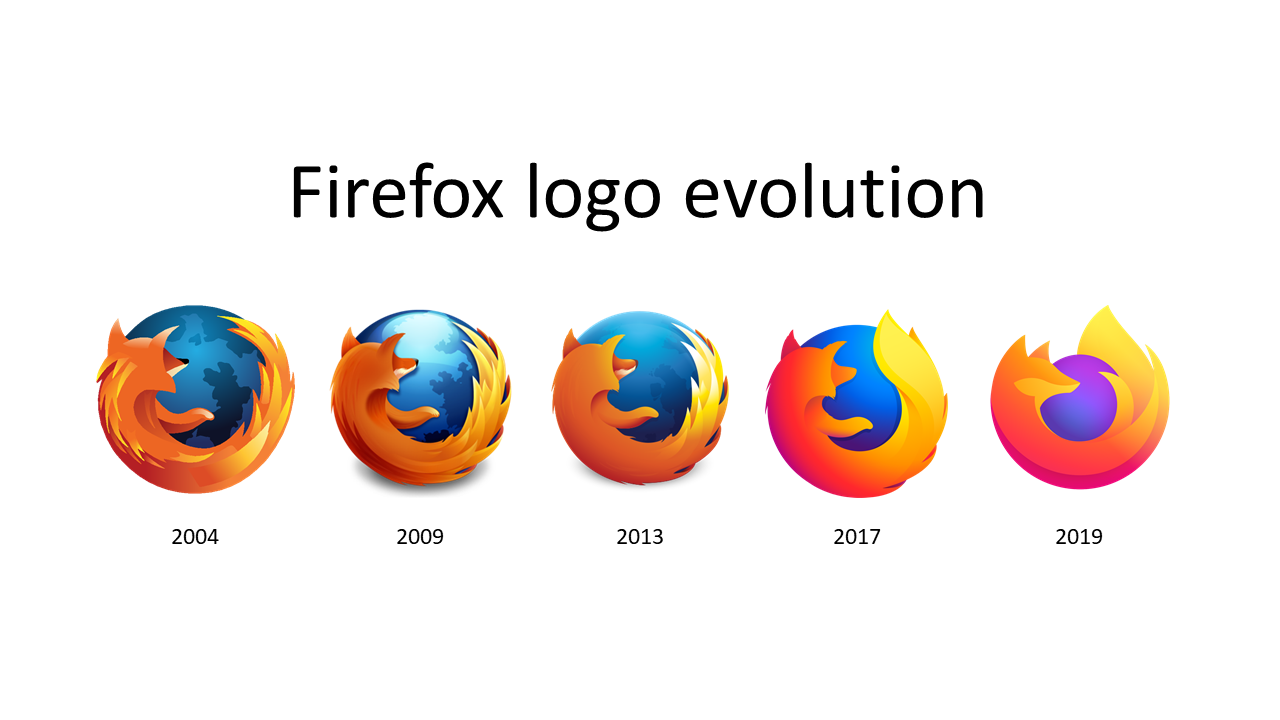
Firefox has been updating its logo but its usage is still sliding into increasing irrelevance. (And I say it as a Firefox user that likes it.) Maybe it’s more modern and more dynamic now, but there’s more to a project than logo.
I not perceive that as a personal affront, I might: The more growing of age, the more looking glasses become of help. Especially on my stack of outdated rambling paper maps that cram so much information in 1:25k that fine print goes down to 6pt or some such.
Another take: The osm.org landing page activates the input box with placeholder text “Search” – so the Logo looks apt to me from there too. That might hit home with younger people with proper eye-sight? Or what is the current symbol for searching? I can only think of a dog, sniffing for drugs or people buried under an avalanche…
I think it’s still good. I agree that there comes a time to modernize but for me there’s no pressing need yet. If someone wants to suggest something I’m open to that - as long as we’re not paying a consultant a million Euros to provide us with rounded corners and a warm and fuzzy feeling.
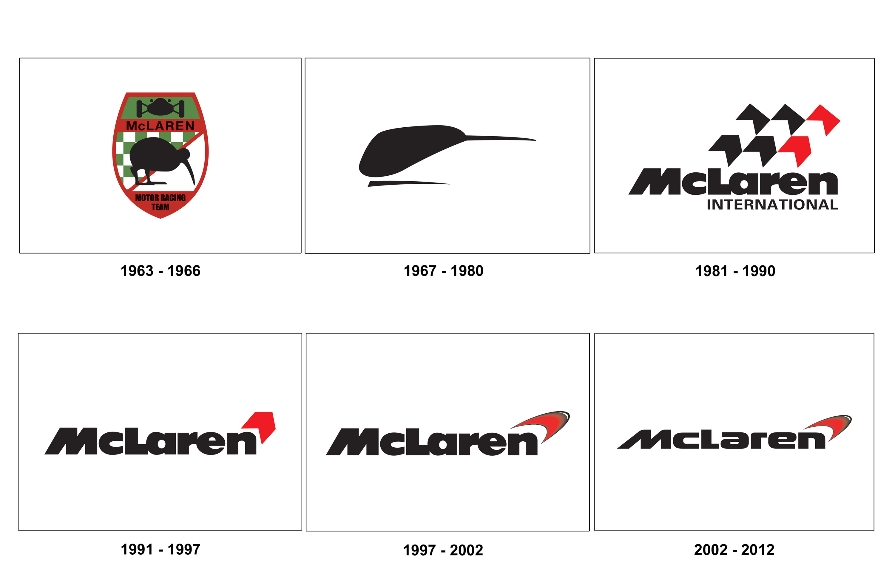
It is worth noting that all your examples have kept the core elements of the logo in place, simply evolving the existing form to a more modern look, whereas you seem to have issues with core elements of our logo and would like to change it entirely, or have I misunderstood?
Personally I would put a more positive spin on this: As a grassroots community project, we’re aware that our logo will be used, re-used, and re-mixed by the community and we want to encourage that, instead of tying their hands by being anal about “corporate identity”.
… A logo on testing working both in light and dark theme
(but, it’s really wurscht to me, the community forum logo up top works too and doubtlessly many other ‘localized’ versions do as well).
I’m not a fan of the over simplification trend and I hope OSM doesn’t jump on that train too. I like the detailed map logo. I would be against additional high contrast, black and white, dark mode, light mode versions. Let’s say more of the same.
// Update: Holy Typo!
// “I wouldn’t be against additional”
//_______^^
Going by current mainstream apps on Android, magnifying glass is still used as icon for search. Main difference being that the icons generally have the rounded glass in the top left corner and the handle pointing to bottom right, so flipped orientation from OSM logo’s icon.
Maybe it’s because I’m younger (both in age and in OSM) but I could see a revamp. Agreed the standard convention for the magnifying glass is flipped. Additionally would like to see a node, way, and area represented on a simplified map of somewhere significant to OSM (maybe first edit or office or London etc.) that would add more meaning to the logo than the skeuomorphic design we have now which is outdated in tech standards.
However, this very comment proves our biggest hurdle, we need someone with knowledge and respect for OSM but also design talent and willing to donate their work to the project. We’re great as a group with commenting on everything and finding what’s great and bad about something but you need a few designs with a few revisions for that to come to reality.
In fact, I’m a bit puzzled that it logo doesn’t appear in the the wiki page Logos § in Europe. Does anyone know why? There’s an uploaded file, but it does not appear in that page — possibly because it has the text part attached:
And btw, OSM Albania seems to have adopted it (or was it the other way around?), which I applaud — it’s much more amenable to variations. For example, in my city we established an informal group of mappers (OSM Braga) and used that logo with some minor color tweaks and a local landmark inside the magnifying glass as a way to customize it:
The current logo proved very forthcoming to this – lots of variations that just swapped the contents inside of the the magnifying glass. And BTW, I count the UK logo (though blank inside of the magnifying glass) a mere flattening of the gradients in the official one, so not in any way original.
From design perspective: A logo should be recognisable in thumbnail size OTG thumbnail (1.5×1.5 cm), it should be a square, and it should convey what the business is about: What the current logo depicts: OSM is about finding stuff on a paper map (the outline of the background matte suggests that.)
IMO the current Logo (that I like a lot) meets criteria 1,2 very fine. I am all but certain if OSM wants to be useful though in the way the logo suggests?
It’s the other way around. As per the summary on the page you linked to, it was designed by Elio Qoshi from Tirana, Albania. as an adaptation of his File:OSM Albania.svg.
P.S. I like the OSM Braga logo too. The bright colours are nice.
I disagree that your criticisms have to mean we need a new logo. Rather we could invest into making the logo gracefully “degrade” in complexity when scaling down… similar to most OSes handle their application icons:
I am ambivalent. I agree that the logo looks a bit old fashioned and a bit skeuomorphic, and I agree that it is reasonable that it keeps evolving. On the other hand, our logo is established and recognisable. “If it ain’t broke, don’t fix it”.
But IF we were to redesign our logo, I think it should better emphasise that OSM is an open, collaborative, project. Our current logo symbolises in my interpretation “a map you can search, and is built on data”, and the openness lies in its name only.


