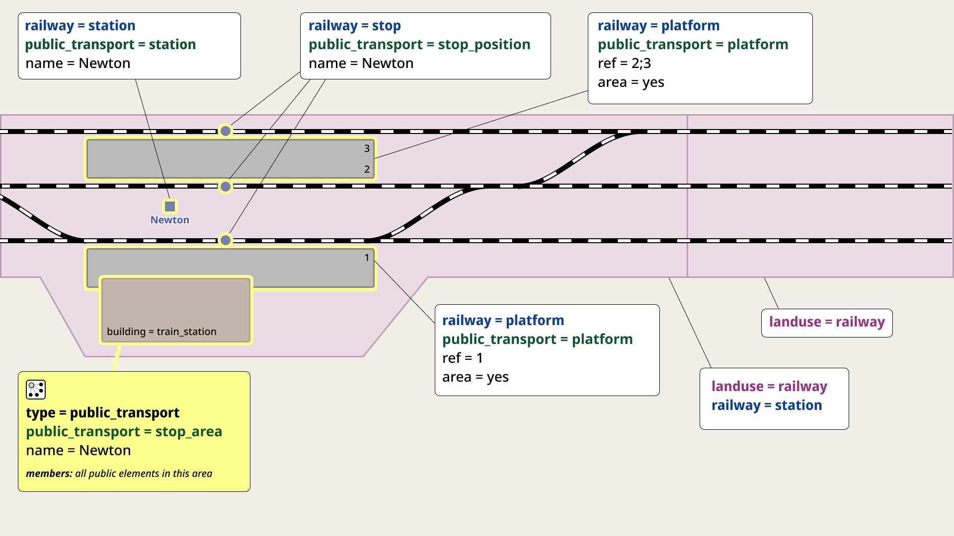
Thanks for the support! I tried to take @gymate feedback into account. I increased the text size, brought back the station name, and darkened the outlines of the landuse polygons to make it clearer that they are distinct areas. I also restored the English label. Sorry about the Ukrainian text — I missed that I’m creating the diagram in Figma, and it can be exported as an SVG.
After @stevea message, I decided to cautiously reintroduce the colors. I colored all railway tags in dark blue, public_transport in dark green, and landuse in a dark violet-pink.
I also moved the building=train_station label directly onto the building and added platform numbers. I think it turned out quite well. Looking forward to your feedback — if you like it, I’ll rework the simplified tagging diagram in the same way.
I like that you’ve brought back color, thank you. However, the distinctions between the particular blue and green you use are virtually indistinguishable to me, and I am not color-blind in any way. (I also realize that color-blindness does affect some people and that the use of color in diagrams like this does lack some ability to communicate for them if / as we use color).
So, better, yes, though I’d like to see the colored text be more distinguishable between the dark blue and dark green.
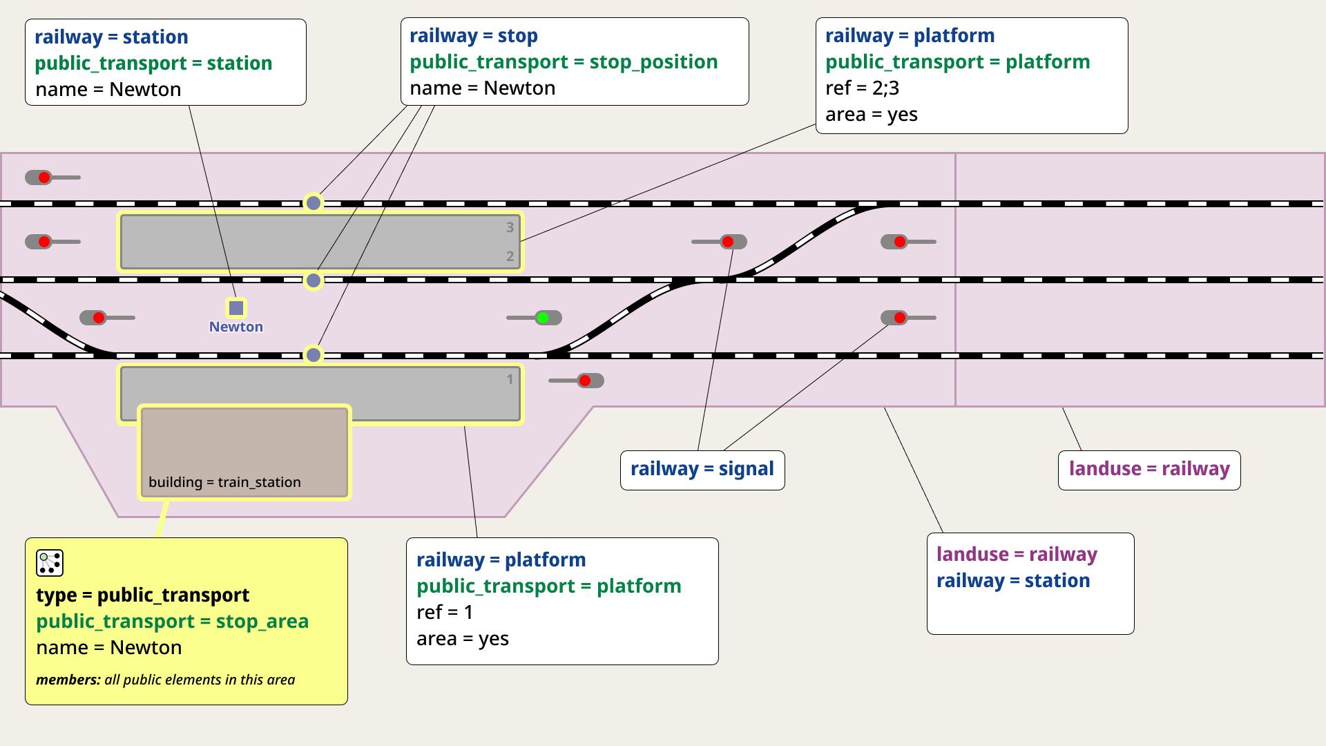
I largely agree with the history and usage of the red/green semaphore/signals, although they were useful to distinguish the “boundaries” between where landuses begin and end. In the newer diagram, that not only is “less clear,” it is simply omitted, making it somewhat ambiguous. (As in “on that side of the crossover…” but especially for stations with many tracks, this remains unclear). I don’t know if this means the semaphores should come back in, but then…how are landuse boundaries determined? The newer diagram simplifies this, but it doesn’t make it clear where landuse boundaries are. I don’t know the best solution for this, but I agree the newer diagram looks less cluttered without the semaphores.
The method to convey the relation (using our “relation icon”) and the yellow color “including” relation elements together is excellent: that’s a great feature that has my head nodding.
I’d like it if we got more community participation in this discussion and/or allowed these changes to “stick around” for a while (a couple weeks, at least) before any finality about them are agreed to. Thank you for your efforts, @darkonus !
I’m not rushing with the changes — I agree with you that it’s better to wait until more contributors share their opinions. I’ve invited others to join this discussion in my diary.
To remind you again, it’s not merely “fiddling”. This was the tentative result of discussing the area feature for the station rail operation area, when railway=station is to be preserved as a point for linear referencing. Do you have better suggestions now?
The other limitation is the lack of an area feature for passengers. At the time, public_transport=station was discussed to be kept together with the railway=station . Either they need to be separated with a sptatial relationship or another attribute (public_transport=yes ?) to associate the two, or another area:public_transport=station would be needed. The former option was discussed with others in private recently.
The other limitation is the lack of an area feature for passengers. At the time, public_transport=station was discussed to be kept together with the railway=station
my preference would be to use public_transport for the publicly accessible areas and railway for the whole station
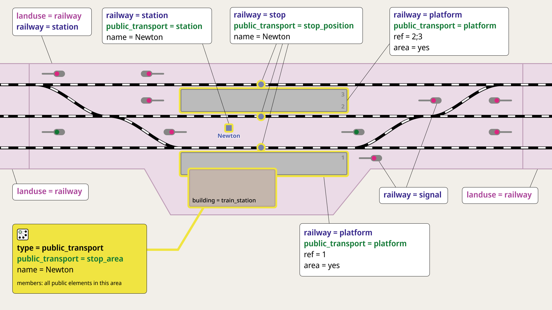
I make a request to the diagram under discussion to slightly further revert to the previous. This involves “shifting right” the entire image (on the landscape-framed page or background or window) so it is better centered (losing the mostly “white space” on the right hand side of the diagram). That right hand side can be “tightened up” and the left side that expanded would be so much better showing the railway=station (tagged polygon) as a “whole island” along the “strip” (usually) of landuse=railway restored as before. There is a harmony there missing from the present diagram. We used a color change to depict this. It was nice. Your colors might not do that, but certain things (I mention here) lined up so nicely there (visually, like blocks fitting together, irregardless of color), yet don’t quite here. Let’s simply balance things and show those left crossovers like the ones on the right, restoring the whole station and its boundaries (polygon edges touching of ways tagged railway). I love seeing how pieces fit together cartographically, and a natural patchwork seen in the original diagram is missed.
Imagine like this (in the wandering eyes of a mapper…): there is a nice, linear railway (strip usually, a polygon) flowing along the landscape. And then there are “islands” mixed in where stations are. A (linear) landuse, occasionally a station, as a “surrounded” island in a strip of landuse=railway (but with those also-tagged landuse=railway PLUS railway=station. This is a natural patchwork in the visual fabric of “railways and stations together” that to see it described (and perhaps prescribed isn’t too strong) “off-center” and with its missing landuse centering (on the far left side of the original, but not discussion graphic) makes this diagram feel just that bit (on the left) “off-balance.” If we could restore that with the present everything else, I would be honored to see us improve that much more. We can do that. Otherwise, hats off again (to all of us) as it is going off like fireworks at “visually describing,” which is about where this is (in my mind, in my opinion…). I’m listening.
With more discussion, we continue to improve. It’s an honor to do this with us.
I can agree. We still have to ask editing software to stop using railway=station + public_transport=station presets, as they can’t detect this before validating. I don’t know how iD can ask users to do this properly though, only adding public_tranposrt=station to the railway=station when there’s no area for it already.
What about the railway=station issue? To be clear, I personally prefer allowing it on areas, and finding other solutions for linear referencing, routing, rendering, and other uses. Unfortunately, you have to convince the other side, which didn’t work out ultimately. area:railway=station is a viable alternative and compromise.
what about node:railway=station for the node? Railway stations are “big”, for big things, an area is the default, adding a big thing as a node will omit significant information (extent, shape, orientation, topology), we should generally discourage omitting this information, and area:highway would send the wrong signal. It’s the node representation that is weird, not the area.
The issues I have with marking railway=station as an area area:
the proper delimitation - should those include distant signals, that are being controlled from the station; should those align with parcel division; what is the buffer length from a track (embankment, ditch, fence etc.)
no control over node position - especially it considers stations with larger yard parts (eg. OpenStreetMap) - with that the node would be placed outside the platform, being the point of interest for the passengers (even if the station could be only passenger-oriented)
consistency - other railway-related points such as junctions, yards are mapped as points. As far as I know, railway operators assign the axis of the station in their documents (often being the signal box, train station building, platform center), thus it helps with positioning the node. Given the example above from Warszawa Praga, the axis is defined to be in the middle of the platform, even if this station has larger freight parts.
For me, it’s kind of similar to how cities and towns are mapped with both node and borders. And as I recall, there is some type of railway-related relation (interlocking) which involves signals and switches, thus being the method of grouping object belonging to one station
yes, they might align with parcel divisions (but not necessarily, if there is a fence the part “outside” would maybe not count, up to decision and maybe depending on the local situation, but not a showstopper IMHO).
I would have thought that switches are the relevant part, no idea about signals and where they are controlled from, generally a “station” is made from the rails, and switches determine where the rails connect to other rails, e.g. the track outside the station.
The station area allows for the computation of node positions which make sense, and is not limited to a single position, but can take the direction from where one comes, and the means of transport that is used, into account. These nodes could be for example entrances to the station.
Also, taking into account or giving priority to the area of public_transport=station rather than railway, can help solve this problem.
For yards, the same arguments as for stations hold true, they should be tagged as areas and not as nodes. I have not seen many yards mapped with a specific tag (mostly I see landuse=railway), but you can often deduct the minimum extent by looking at service=yard tags on the rails.
Generally, everything that is bigger than small and occupies the whole area, is better represented as an area compared to a node.
cities and towns (as geographical objects) can be mapped as areas or nodes, but not both. This should not be confused with political boundaries (which typically happen to relate to cities and towns, but not necessarily, they are orthogonal, not at least because political boundaries tend to divide the whole land, while cities and towns are about built up space).
In another iteration of the diagram, I tried to follow the suggestions from @andygol and @stevea. Specifically, I chose the colors to be as distinct as possible for people with different types of color vision deficiencies. I’m completely new to the world of inclusive graphic design, so it might not be perfect — but based on the tools that were recommended, the colors seem to stay more or less contrasting in most cases.
At the same time, I reworked the layout as @stevea requested. Personally, I liked my first, more asymmetrical version better, but I understand this is quite subjective. As always, I really appreciate the feedback and look forward to hearing more thoughts!
Adding a landuse=railway bubble to the far-right-side (polygon, that flows off the far-right-side of the page — just like the one on the far-left side) would absolutely clinch it for me. Thank you!
It would be easier and more widely accepted to introduce area:railway=station ( area:railway= was also already drafted) than to replace railway=station points with another *:railway=station
=junction and =yard being points isn’t an inherent disagreement. It’s rather that area features hasn’t been considered for any of them. They could be reviewed together. As mentioned, landuse=railway is currently drawn for them already. They simply lack a proper feature. railway=interlocking isn’t the same as stations and facilities, for which there’s railway=facility at the same time.
I would however suggest to remove some of the signals and only keep a few (2-4).
That would make it a bit less overwhelming to look at, while not losing any relevant information. Afterall we don’t have to worry about the proper signal placement, the railway companies already take care of that for us!