Yeah, but we don’t. I think this is because most amenities are either not as large as a railway operating site, or most of their area is public, so rendering or routing to them is a much simpler task.
Yeah, but we don’t. I think this is because most amenities are either not as large as a railway operating site, or most of their area is public, so rendering or routing to them is a much simpler task.
think airports, but also supermarkets (storage is not public), museums (archives not public), factories (few if any public areas), cemeteries, archaeological sites, and many more large scale facilities with possibly multiple entrances. Also parks for example are not so different from a routing point of view (large extension and several entrances). Railway stations are not so different from other POIs.
Fair enough, but I think I’ve already replied to this concern.
I updated File:Railway-station-tagging.svg and File:Railway-station-tagging simple.svg to this version. I also switched back the illustration used on Tag:railway=station to this.
1 Like
I’ve uploaded this flowchart to the wiki as File:Railway station node placement flowchart.png and added it to Railway_stations#Location and Tag:railway=station# How to map.
1 Like
Also, I’ve updated Railway stations and Tag:railway=station to reflect the new tagging schema. Thank you very much for all of your help! ![]()
1 Like
you are now documenting area:railway=station for the station area, but this has 2 uses globally. The wiki should reflect actual tagging, please revert this.
https://taginfo.openstreetmap.org/keys/area%3Arailway#values
There was a 50% increase for area:railway=station in the past 2 days. There are now 3 uses of area:railway=station. Please revert your edits asap to prevent more pointless tagging fragmentation. Make it a proposal if you believe it is a good idea, but don’t document it as established practice when it is basically unused.
1 Like
As mentioned before, area:railway= was already proposed historically Proposal:Railway Schematic Mapping - OpenStreetMap Wiki
An area representation of railway=station can be logically provided for in area:railway=
An alternative is needed now to replace railway=station areas without losing info. Using landuse=railway alone means others will need to check and add back another feature again later.
and that’s what it still is - at most: “proposed”. It is not used. (and this specific proposal from 2013 is marked as “abandoned”, so please excuse if I am not interested in investing time to read the long text).
Around here, we are mapping railway=station for at least 15 years, although it is not so easy to find examples because people from remote removing some of them, but here are some older examples:
It never was necessary to distinguish “railway” and “area:railway” for these, because it is already implicit. And they do not have to be “replaced”. A node is a node and when it is a way or polygon relation (or some other geometry, e.g. site) it is not a node, very simple.
That’s not what’s being discussed here. railway=station is to be a point, so there shouldn’t be duplicate railway=station areas. This is not about whether the geometry type is “implicit”. It should be type-agnostic. railway=station is a unique individually identifiable PoI feature. Whether for counting, data records, iterating, spatial analysis, searching, routing, rendering, or any application, there shouldn’t be 2 railway=station objects.
That’s not what’s being discussed here.
railway=stationis to be a point, so there shouldn’t be duplicaterailway=stationareas.
it can be either a point or a polygon/area. Like almost all POIs, only very few can only be points, e.g. natural=peak
I agree that we should not have 2 railway=station objects for one station, these are mutually exclusive. If there are both, delete the node or retag it to something like station_centre or navaid, etc
It’s perhaps worth mentioning that the overwhelming majority (93%) are nodes. There are entire countries with lots of railway stations where they’re all mapped as nodes.
1 Like
yes, there are 7000 railway stations mapped as areas, and much more still as nodes.
And 3 are mapped as area:railway=station
Well, no. Looking at the data one of those three could plausible be thought of as being the area of a railway station. The other two are a bit of railway landuse either side of a station.
1 Like
fair enough, I didn’t bother to look into the details, it’s an unused key with some accidental occurrences.
To add to the discussion about object counts, for airports with icao code there are three quarters areas and one quarter nodes: icao | Keys | OpenStreetMap Taginfo
not very different from train stations, although airports typically have more centralized entry points while train stations can often be entered from different directions, which makes it potentially more useful to store the shape.
I don’t say every train station must be an area, it would likely be beneficial, but the smaller the thing is, the less important it is. Many railway stations are also underground, where it is more difficult to map the area.
19k subway stations (many of which are underground, although people don’t seem to tag it specifically, no location combination indicated in taginfo and only 10% have a layer tag): station=subway | Tags | OpenStreetMap Taginfo
FWIW, I have undone the wikifiddling edit which tried to introduce area:railway=station, despite it not being in use.
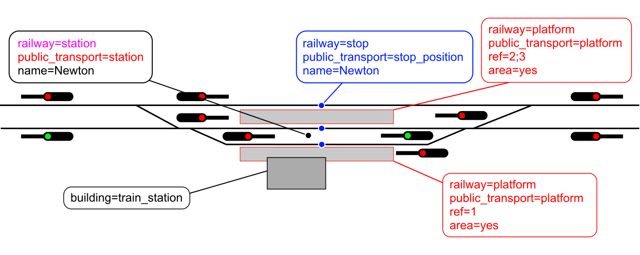
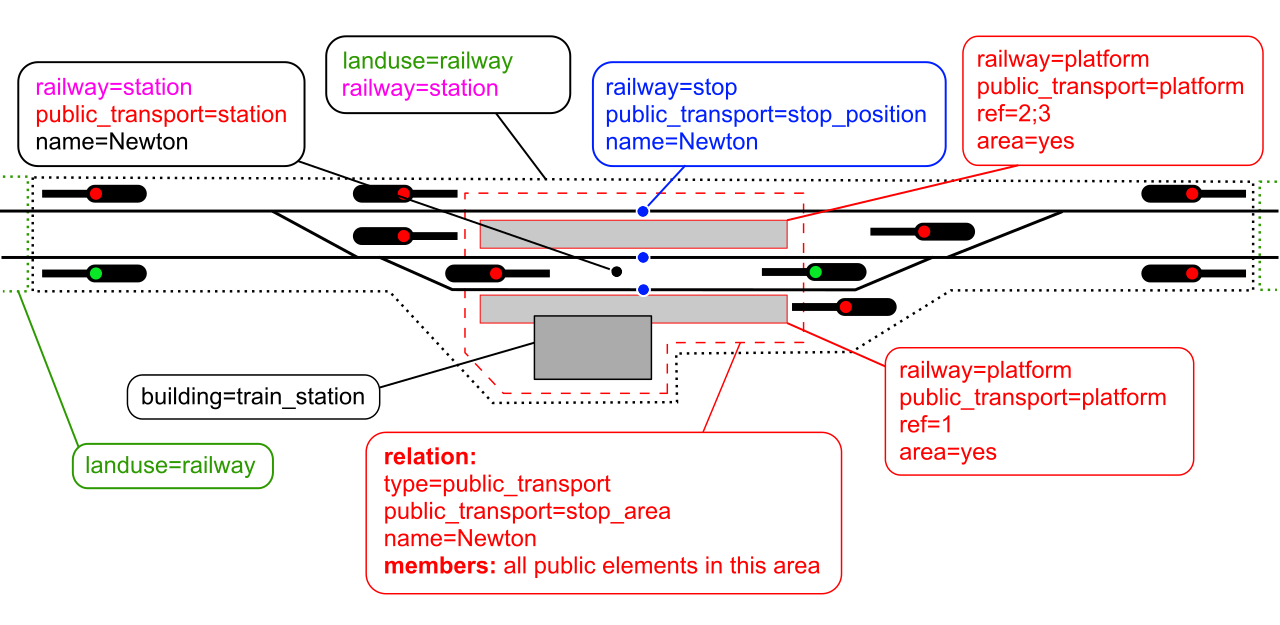
Hi! I’d like to share a suggestion for updating the diagram used in the “Railway Stations” article. First of all, I want to express my appreciation for the current version — it clearly reflects a lot of work and thought, and it does a good job illustrating the key concepts. At the same time, while experimenting with the topic myself, I noticed a few areas where the diagram might be made even clearer, especially for newcomers.
From my perspective — and I fully understand this is subjective — the use of multiple colors might be a bit overwhelming, and it’s not always obvious what each color represents. The way the tracks are drawn also feels a little rough and simplified, though I understand this may have been a practical decision. I wasn’t entirely sure about the purpose of the signal icons, either. It’s quite possible I’m missing something important here, and if they are indeed relevant, I’d be more than happy to include them in a revised version. Still, it seemed to me that the core tagging ideas could be communicated more directly without them.
One thing I found a bit challenging was understanding the meaning behind the coloring of both objects and labels — I imagine there’s a logic to it, but it’s hard to interpret without additional context.
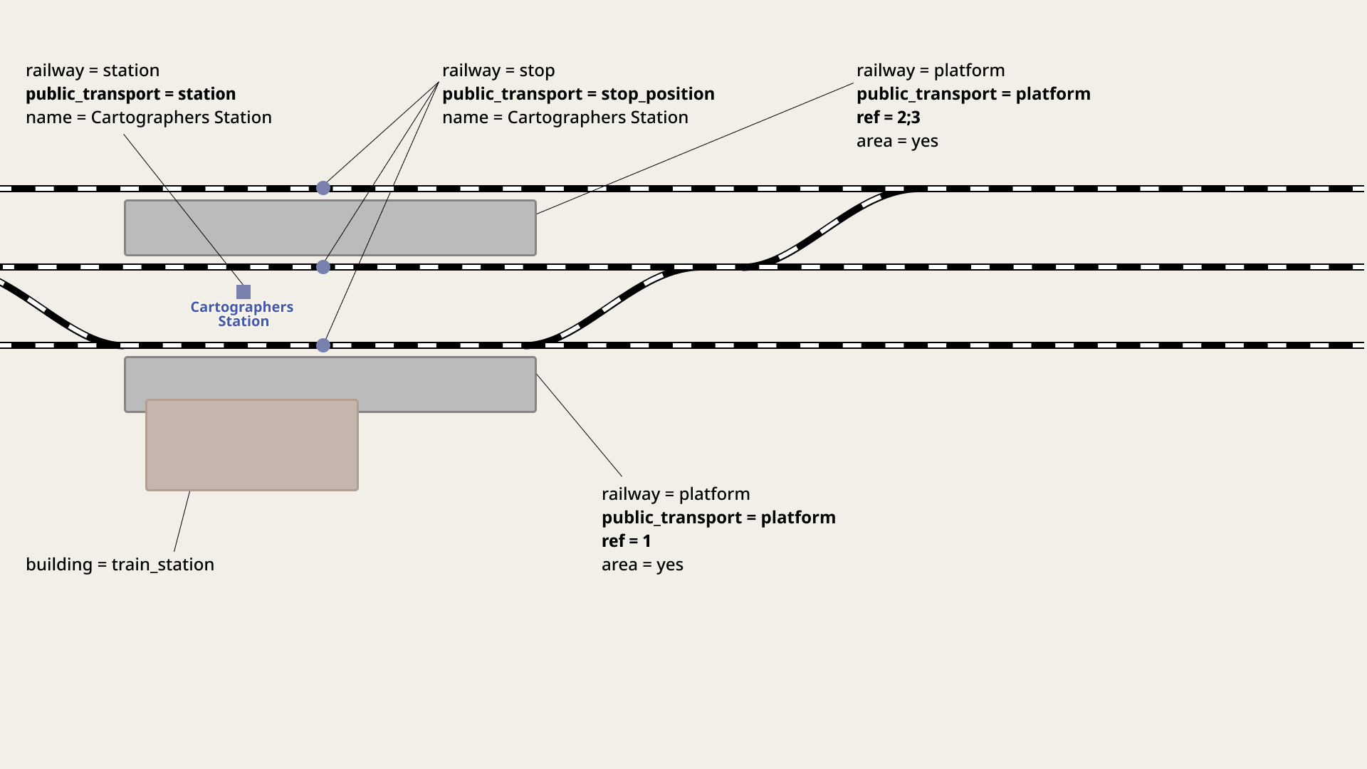
In the version I’ve been working on, I tried to simplify the visual presentation while preserving (and hopefully clarifying) the intended meaning. I’ve kept the object colors, but made the labels uniformly black to improve readability. I also removed some of the decorative borders around text and cleaned up the layout overall. For clarity, I added a yellow outline to highlight the elements that should be members of a relation.
I want to emphasize that I’m still learning about railway station mapping, so there’s a lot I don’t know yet. I’d really appreciate any feedback, corrections, or suggestions from more experienced mappers — thank you in advance for your insights!
Original diagrams:
New versions (in progress):

3 Likes
Yeah, colors lost their meaning during the remake of the illustration.
I totally agree.
No, you’re not, they were just for illustration purposes ![]()
I agree!
Thank you very much, it’s amazing to see a better version of the illustration! ![]()
I would actually keep them in some way as they highlight texts very well. E.g. I think that the highlight behind public_transport=stop_area looks really good.
I suggest the following improvements:
- Larger texts overall
- Please choose a different station name—see the reason here
- Better distinction between the station area and the
landuse=railwayon the open line - English instead of Ukrainian (I guess)
And when exporting the final version, please do it as an editable SVG!
Thanks a lot in advance! ![]()
1 Like
Let’s agree that the “current drawings” growing into what they are now were a working sketch while many heads kept nodding. In its later versions, it became important to distinguish between landuse being railway and not railway and existing pink and new green were chosen to do that. They seemed to do that clearly. What was less clear was that red meant “something, maybe having to do with how we structure relation members” and pink meant “something like that, but different.” Blue was something else altogether. And that’s all we needed: our use of color was enough to “say it” (visually) like that and we (all or most) seemed to understand. And agree.
The newer illustration is a vast simplification. It flattens many concepts and perhaps understandings into a concision (a word not seen often). Meaning that it tries to preserve meaning, but may do that at some expense. It purposefully leaves things out, in order to both simplify and perhaps quicken a particular goal (of more-precise tagging, perhaps). Maybe, but flattening out these semantics is fraught with danger, as its brevity may diminish a deeper why about how tags are structured. Let’s more precisely consider our intended audience when we draw such things.
It’s possible the older version can be a “wet paint watercolor sketch” that allowed us to come to some harmony, even with some good visual improvements (like our particular use of color) to “say what we mean” as we “mean what we say.” However, the present sketch effectively erases much of that, trading its brevity for some potential clarity. Maybe. Maybe the original remains in dusty archives of how we hammered out a consensus. Maybe we come up with a better, newer sketch that doesn’t abbreviate so much. This is slippery in many directions all at the same time; I wish us luck.
1 Like