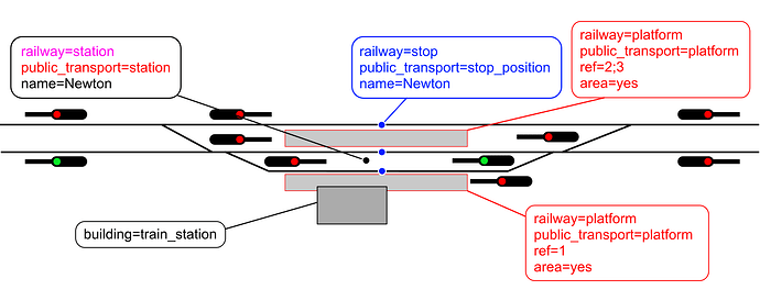
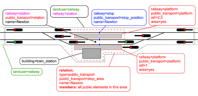
Hi! I’d like to share a suggestion for updating the diagram used in the “Railway Stations” article. First of all, I want to express my appreciation for the current version — it clearly reflects a lot of work and thought, and it does a good job illustrating the key concepts. At the same time, while experimenting with the topic myself, I noticed a few areas where the diagram might be made even clearer, especially for newcomers.
From my perspective — and I fully understand this is subjective — the use of multiple colors might be a bit overwhelming, and it’s not always obvious what each color represents. The way the tracks are drawn also feels a little rough and simplified, though I understand this may have been a practical decision. I wasn’t entirely sure about the purpose of the signal icons, either. It’s quite possible I’m missing something important here, and if they are indeed relevant, I’d be more than happy to include them in a revised version. Still, it seemed to me that the core tagging ideas could be communicated more directly without them.
One thing I found a bit challenging was understanding the meaning behind the coloring of both objects and labels — I imagine there’s a logic to it, but it’s hard to interpret without additional context.
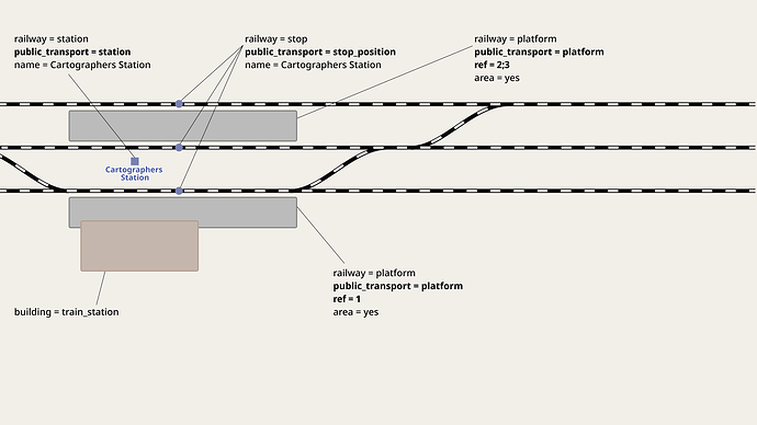
In the version I’ve been working on, I tried to simplify the visual presentation while preserving (and hopefully clarifying) the intended meaning. I’ve kept the object colors, but made the labels uniformly black to improve readability. I also removed some of the decorative borders around text and cleaned up the layout overall. For clarity, I added a yellow outline to highlight the elements that should be members of a relation.
I want to emphasize that I’m still learning about railway station mapping, so there’s a lot I don’t know yet. I’d really appreciate any feedback, corrections, or suggestions from more experienced mappers — thank you in advance for your insights!
Original diagrams:
New versions (in progress):


