I would like to be more efficient at mapping power infrastructure. I found a power pole mapping method I quite like, in the hope that it might be useful for others as well.
In my editing workflow, I have two principles I wanna follow:
- Entire input is human (=no AI or other image processing tool).
- Human should be able to express decisions with as few keystrokes, mouse movements, clicks as possible.
Power poles don’t just appear randomly, they often follow some level of periodicity. I made a website which shows high resolution imagery for Lorain county, Ohio (source). It also shows OSM power infrastructure data, using OIM tiles. Users can click on the map to place a marker. Screenshot of the view:
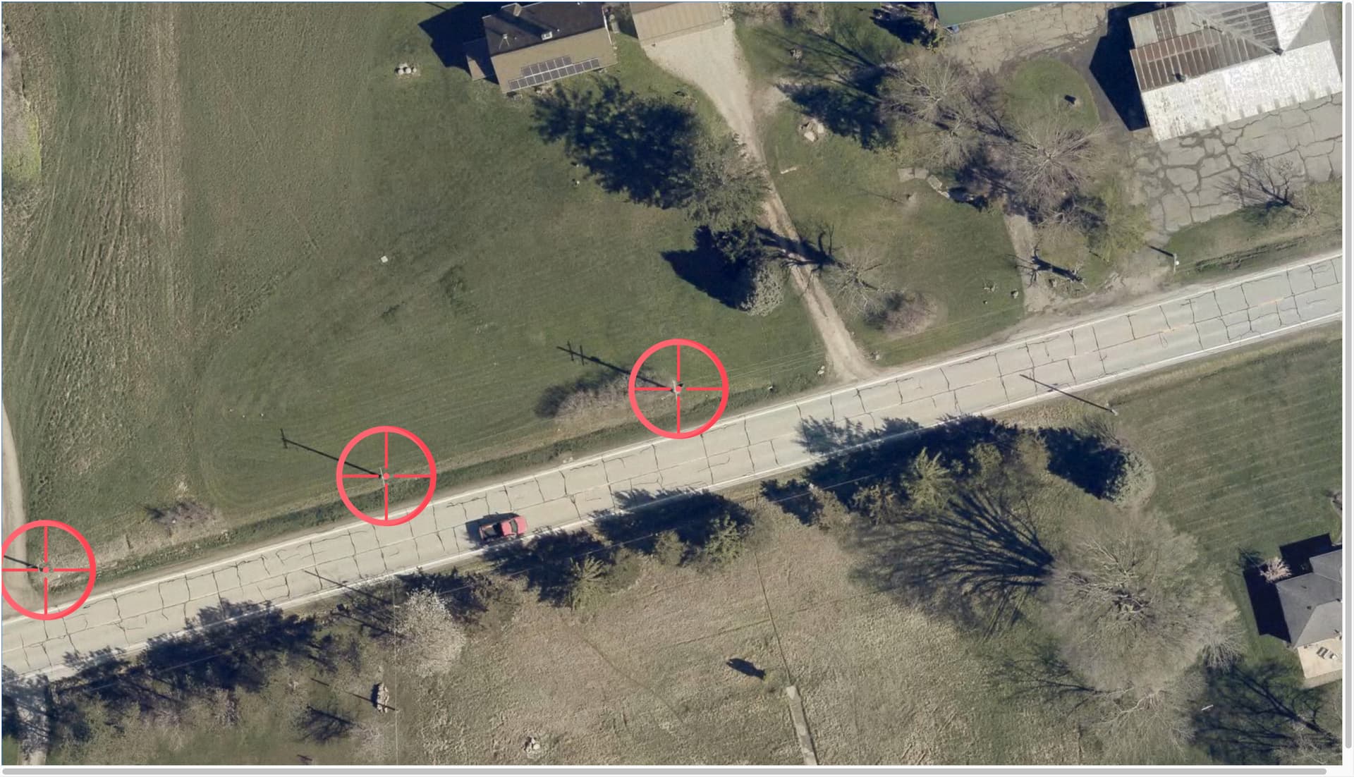
(If you are playing with the site, I recommend setting the Zoom level to 25%, to get many tiles in one view, hence increasing resolution, and not to get ridiculously large markers.)
When a marker is placed, the map jumps so that the marker is in the center of the view. So when objects appear somewhat periodically, users can click on the next object while minimising the need to pan, or move the mouse. Of course, real world is complicated so periodicity is not perfect, but I find this still helpful. A short video of canvas behaviour.
Once the user placed the markers wanted, the coordinates are copyable from browser console. List of markers are console logged every time a marker is placed or removed (which can be done by clicking on an existing marker).
Level0 is easy to use when we need to upload a list of coordinates as nodes and tag all of them as power=poles. (Here is a longer video containing the entire workflow, including upload via Level0.)
Once an edit is uploaded, give a few minutes for OIM tiles to refresh, empty-cache-hard-reload just to be sure, and you can go again. I find that mapping this way enables me to map distribution power poles faster than using any other method I tried so far.
Possible future improvements I have in mind:
- Don’t just console.log coordinates, thats a bit cumbersome.
- Expand to more locations than Lorain County, OH.
- Show infrastructure in more detail, especitally the power validation layer of OIM would be really nice, to help find places where lines abruptly end and similar.
- The above workflow is for power pole mapping. It would be better to map the lines as well.
- Having to zoom out in the browser to get high res imagery and decent sized markers is a bit hacky.
If you would like to use the site, but you face problems, let me know! I don’t yet know what else this is useful other than power poles and power towers, if you have other somewhat spatially periodic nodes to map, I’d be happy to hear about them.
If you are into power mapping, but would stay with normal tools, talk to Tobias from Open Energy Transition, they have a nice JOSM-focused talk on how to get started with power mapping. Worth going.