Hi,
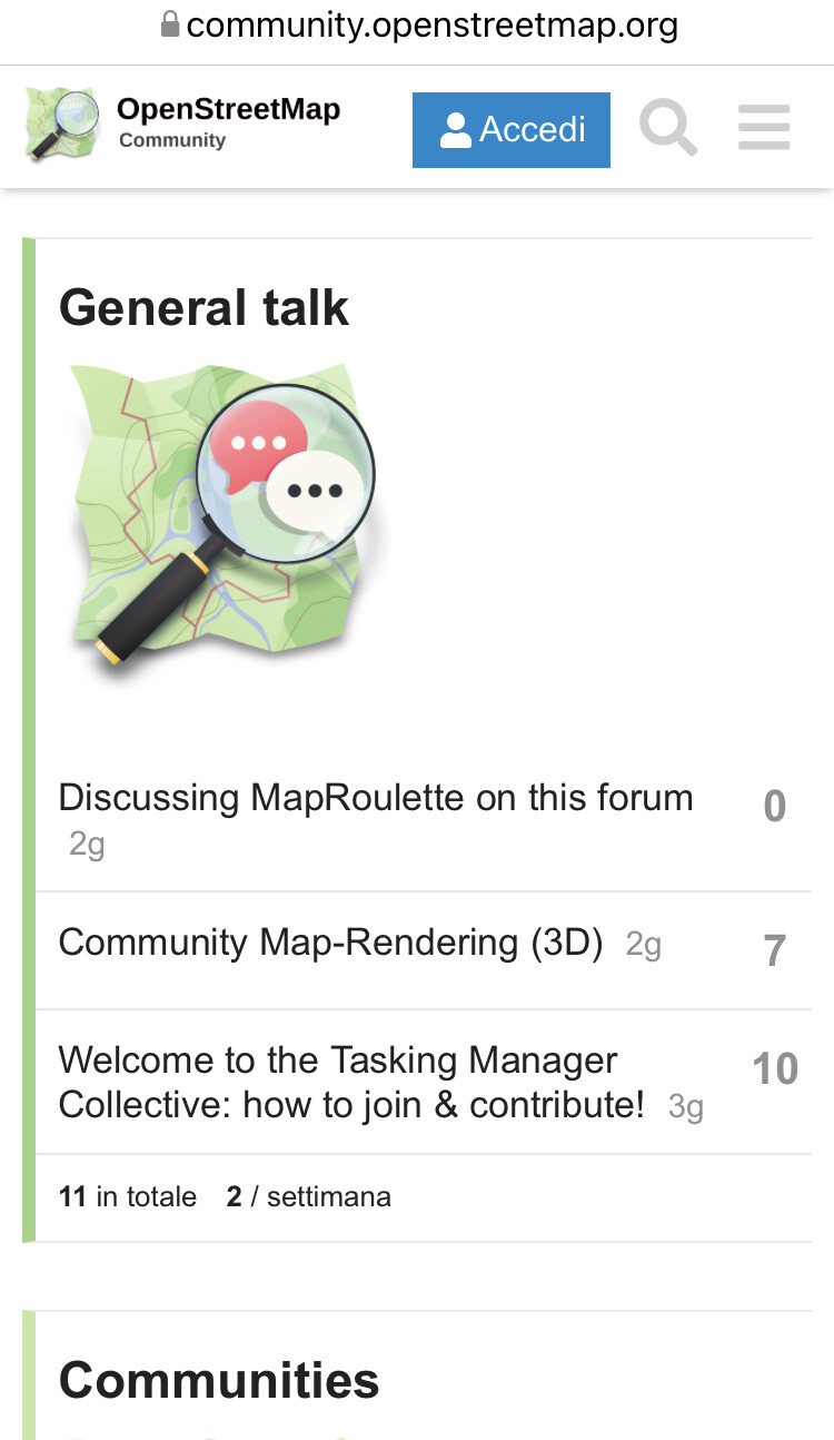
As probably everyone knows, on the main pages, each category has an image. Personally, those are quite distracting, so is there a way to disable them?
Hi,
As probably everyone knows, on the main pages, each category has an image. Personally, those are quite distracting, so is there a way to disable them?
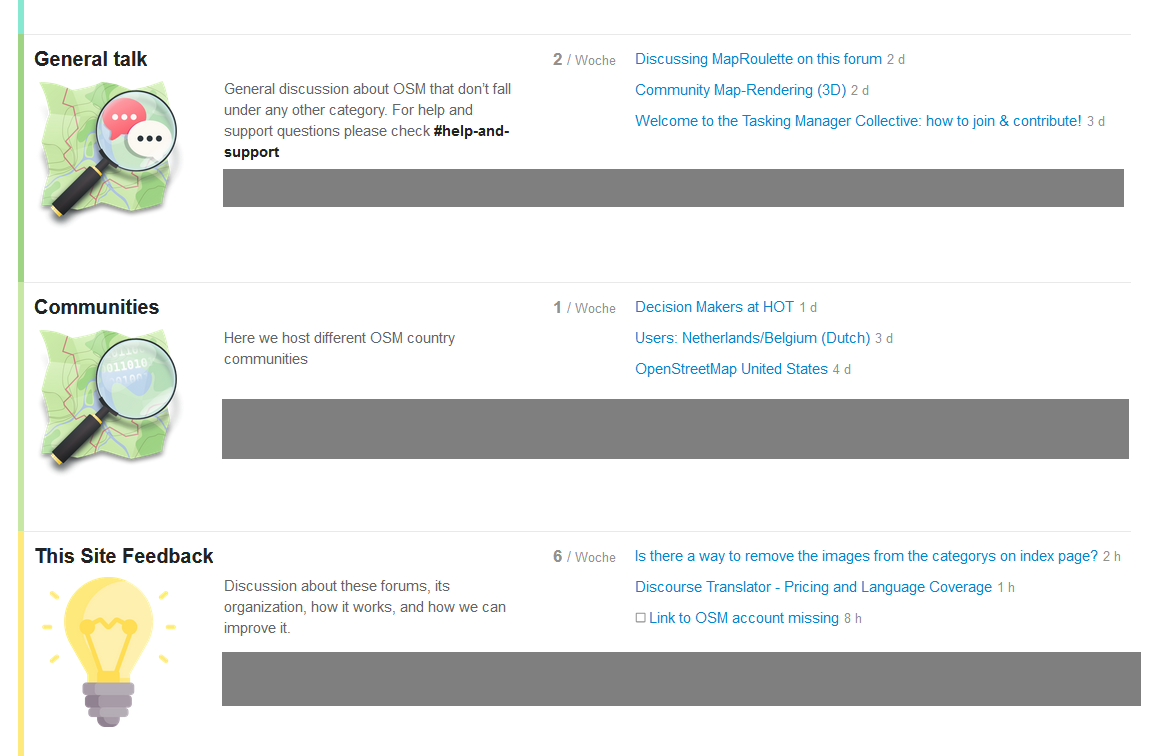
Not an answer to your question, but I’d like to suggest to the admins to reduce the image sizes on the index page by about 50% because it looks like the icons are always the elements in the layout that have the biggest height, creating dead space. See the grey areas in this screenshot
yes, on mobile screens the icons take up a lot of space, and should probably be hidden completely, or at least become smaller, like the size of the title
+1
I have also noticed the huge icons/images before but did not pay attention. I would support a downsizing to a max. of 50% or even complete removal.
The more top categories this forum will contain, the more these huge pix will disturbe.
People can recognize images much easier than words or phrases, that’s why they are so frequently used - and therefore I think, we also should do so.
But the image size and the place where images are shown should not be considered in isolation. It’s one part in the overall context of the Discourse main-page.
This raises the question which information should be displayed and which can be dispensed with in favour of clarity.
For example, I could imagine to do not show sub-categories, because the category description already gives an indication of the category content and therefore it’s not absolutely necessary to show them. In addition, some main-categories are likely to have a large number of sub-categories (e.g. Communities), which may also cause space problems.
Another part is the main-categories ordering, which also plays an important role for clarity. Some (many?) countries will get main-categories and therefore a longer list can be expected. The question is - which categories first…?
Personally, I would prefer the international ones first, followed by “Communities” main-category followed by country main-categories and at the end “This Site Feedback”.
@wolfgang8 I think a big role in keeping Clarity is having this forum organised as close as possible to the old ones, which would solve some problems you’ve stated:
Ordering should be similar to the old forum, sub-categories of country communities should be shown, and please, no images.
While some of these are presumably possble, there will always be some level at which the new forum won’t be able to do what the old forum could simply because it’s different software. For example, the old forum was accessible without Javascript - this one isn’t.
That is actually kinda sad, though not even what I meant. I meant really just categories and ordering.
Images and icons are helpful if they clearly represent something - for instance a “heart” image for like or love, a “question remark” for help etc.
A “stylized map with magnifying glass” does not give you any clue what it’s standing for, and if it is used twice (to stand for “General talk” as well as for “Communities”) it does not make any sense at all.
The old forum is clearly structured and very easy to overwiew without any images in use - much better than the fancy surface of the new forum startpage with it’s oversized and senseless images. I cannot see any progress here, just reminds me of
as Gendy54 commented an earlier topic.
Yes, for users migration is easier if the structure of the new platform is similar to the old one - and I think that will be the case after data migration.
There already exists a test migration to get a first impression: http://freebox.computel.fr:4200/
For me, the goal is to build upon the old forum and develop it further on the new platform with its enhanced capabilities.
Yes, well chosen images are important and improvements are always possible!
But basically, for me it’s easier to select from multiple lines of text when an image is displayed at the beginning of each line instead of just text lines.
I actually really like the images. I browse most on mobile phone, and they look great there. They make it very easy to jump to the right section and they add character to the page. In contrast reading the mailing list archives on mobile is terrible (the page layout is not optimised for small screens and being just text based it is not that appealing).
Currently we don’t have a lot of categories on the homepage, but we have a few options to reduce the size of the images that we listed here:
Maybe worth continuing the conversation there so we consolidate all the feedback about the homepage?
Thanks!