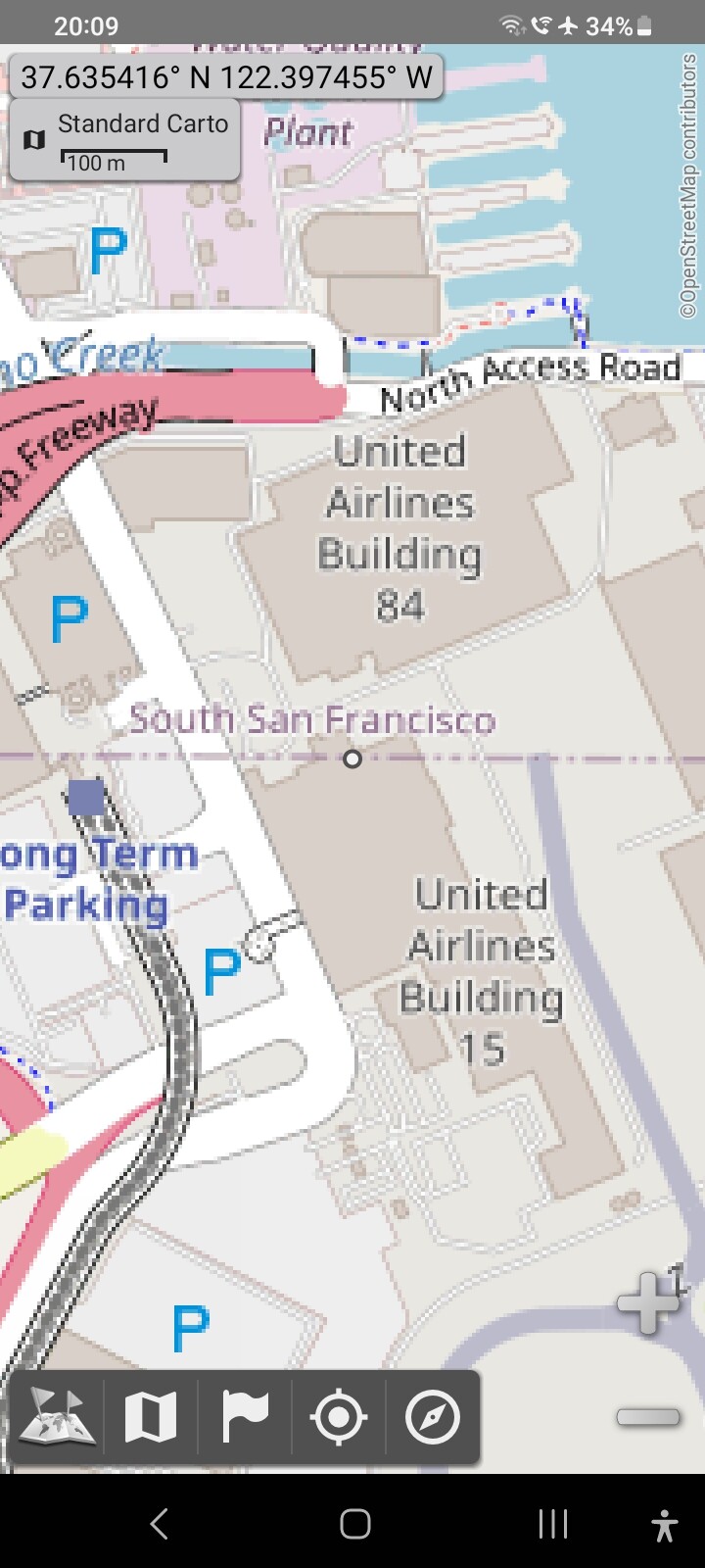
And it’s the usual very frustrating question: is the political entity on the other side of the words South San Francisco, just simply an unincorporated area, or is it some other suburb that’s name has now crawled away as is the habit in this particular “carto” layer. Yes we could go around the map hoping that will find words name is crawled to. But let’s instead try something different: finding a layer that has all the info right there using different colors, and big names: a political map!
Sure, if we were using the osm website we would simply do a query.
However we’re in a app where we depend on switching to different layers.
Therefore it be really great, it would be really wonderful, if there was a source of tiles, with colors indicating, what political entities we were looking at!
Then we could tell if the land on the other side of the border pictured here, is, unincorporated land, or actually belongs to a different suburb!
(Yes, a query finds that it is in unincorporated San Mateo County. But that’s beside the point.)
… then I would suggest that you create one. Maps don’t get created by forum posts, or github or mailing list posts either.
Many different sorts of maps exist, but the most documented process is probably the one to create raster tiles, such as you can see at openstreetmap.org. I’d start here, and then I’d change the style to a simpler one that shows boundaries, perhaps based on this one. Then tailor it to your needs.
Realistically, for all sorts of project- and people- related reasons (that don’t have much to do with data or technology) that’s not going to happen - “OSM Carto” is what it is, and our experience from the last 9 years or so suggest that it is not going to change.
However, to be clear - the OP here isn’t using OSM’s “standard layer”, but those map tiles in another app. It’d be perfectly possible there to overlay boundary data over the top of OSM Carto tiles.
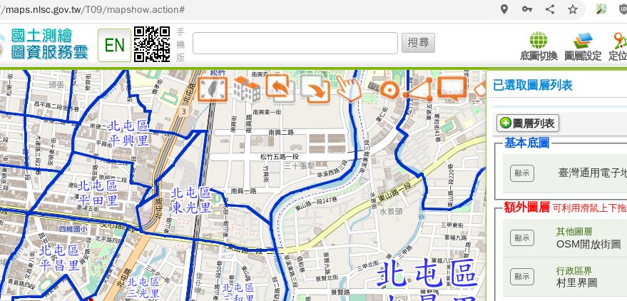
Here is an example of a map that shows boundary data as a separate layer. If anyone wants to create a map like that, they can - but they won’t be able to do it by just writing forum posts.
files, and then finally people would have an overlay to see OSM boundaries clearly!
Actually all that is needed is a transparent boundaries layer.
Also, as such apps cache the maps, it won’t download a tile again for several months, saving your server work. (As far as people using other ways to view the tile, well maybe they will request it again.)
For raster tiles for the planet for just boundaries, I’m guessing about $1 per day for hardware costs.
Initial server setup would be a couple of hours for someone familiar with Linux, then maybe a day or so if they are as yet unfamiliar with osmium etc.**
You could spend as long tinkering with the map style as you’d want to spend, but you’d need to spend at least 1/2 day here I think.
I’m assuming for boundaries you don’t need to worry about “minutely updates” - you’d just reload every now and again when something important changes.
Regular maintenance would be no more than a few minutes a fortnight for Linux updates, checking that certificate updates are happening as they should, and making sure that your hosting provider and website name provider have up to date credit card details so that you can pay their bills on time.
** all of these time costs will be more if you need to learn more about things as you go, but the resources to do that learning are definitely available.
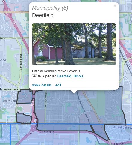
Actually, this works anywhere on Earth. The particular rendering is zoomable and pan-able, make sure to check the boxes for admin_level=8,9,10 if you want those, too.
Yes, when mapping, for both touch-typing reasons (versus “thumbing a touch screen” as many do with smartphones) and for display reasons (this rendering is beautiful on my 5K Retina display, even as I realize not everybody has such a pretty option as their video) I recommend a “desktop class” machine. Warm it up, have a look, enjoy.
People do use inappropriate tools to do things, so while you could dig a hole with a nail file, a shovel works a whole lot better. Mapping? Desktop. Sure, “out in the field,” a smartphone can work in a pinch to do certain, more-limited mapping tasks, but it’s like using a teaspoon to fill the sugar bowl.