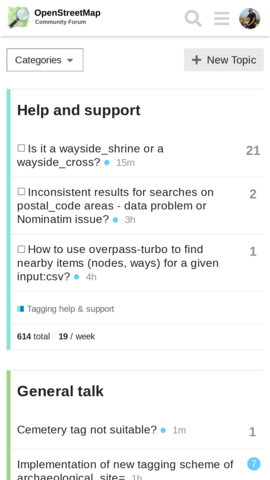
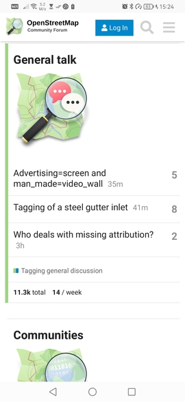
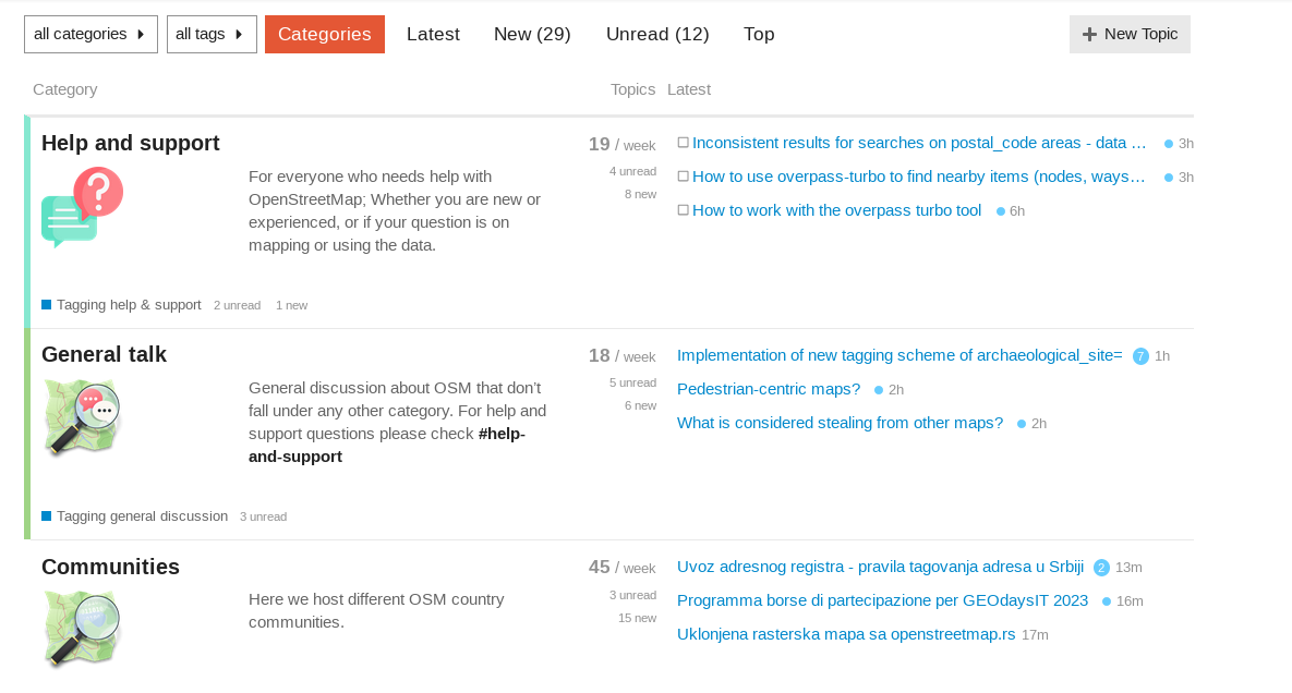
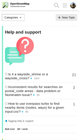
I’m not sure how big it was originally on mobile, but both on desktop (see Hide or downsize icons - #18 by Matija_Nalis above) and on mobile (see below) it still looks excessively big to me eating into much of screen estate for no gain.
On the mobile, it didn’t seem to have had an effect, which while good (it didn’t break anything!) is also somewhat disappointing - as the problem with oversized icons continues there. I agree with previous comment that since screen estate is premium at mobile, perhaps category icons can be disabled there completely, e.g. via media query like:
@media only screen and (max-width: 767px) {
    .category-logo.aspect-image img { display: none; }
}
vs.
(I’ve also tried just reducing icon size more on mobile, but it just looks ugly and does not save much space, because it is displayed in new line with margins etc. anyway… It might be possible to reduce it to say 10% (about height of the letters) and modify layout so icon is inline with the category name, but that is likely more complex and possible problematic - and needs testing on multiple devices - for little gain. But if you wish, I can try to investigate that)
 vs.
vs.