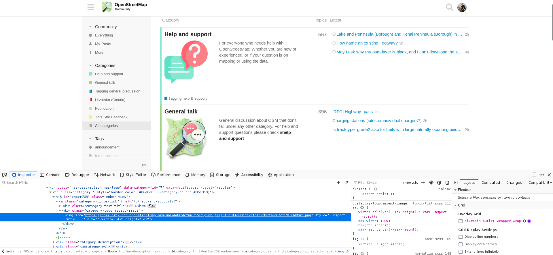
A quick easy fix would be to set the category logo images to a 60% width:
.category-logo.aspect-image img {
  width: 60%;
}
Note that no css changes have been made yet because the technical time has been invested in other fronts. @Firefishy might be able to comment on his though around css improvements to the forum, since he is the one maintaining the whole technical aspects of the site.
What about disabling the icons entirely? Take a look at this example: https://foodshift.se
I really like this design. A nice, short description at the top. Also the colors on the front page are much more balanced. The front page is not so busy as ours.
Why not create two themes?
One Theme with the icons (a little bit smaller please) and one without the icons. Every User could change it by him or herself.
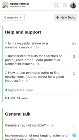
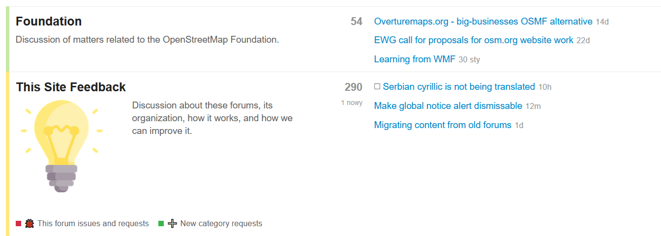
This doesn’t fix the problem reported here. The site still looks rubbish compared to the nice clean layout of the old forum - there are massive pictures filling the screen that add no value, it looks like a four-year-old has gone mad with some crayons. Why can’t we just get rid of those altogether?
(Note that I’m changing max-width in Developer Tools, as width seems to be auto-calculated to preserve aspect ratio - at current version of the community.osm.org website?)
Thanks for your explanation. It would have been great to get this information immediately after the revert so we could have used the time to come up with the necessary CSS …
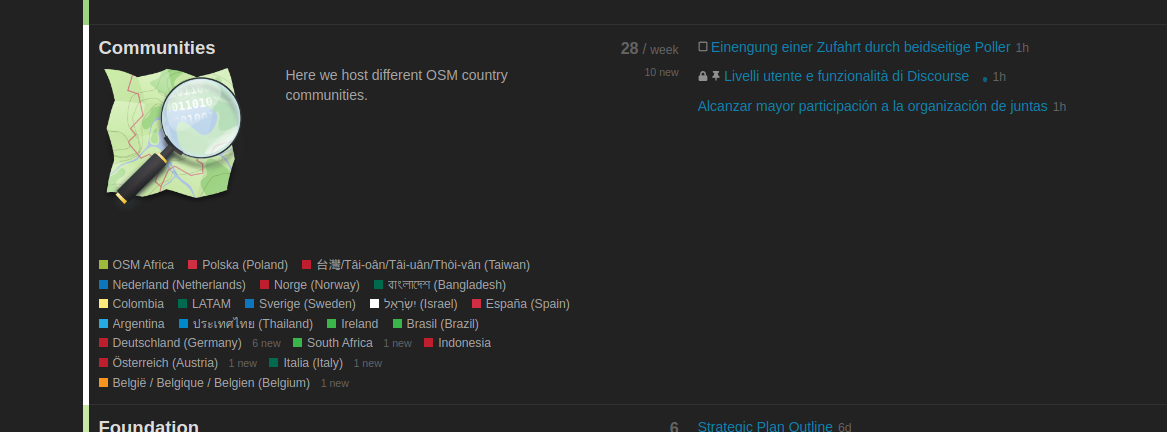
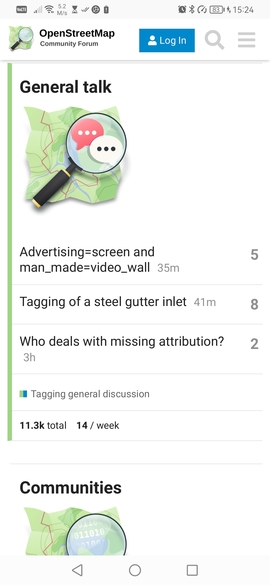
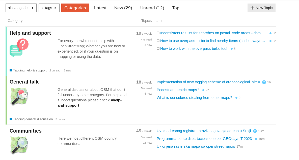
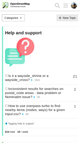
I’m not sure how big it was originally on mobile, but both on desktop (see Hide or downsize icons - #18 by Matija_Nalis above) and on mobile (see below) it still looks excessively big to me eating into much of screen estate for no gain.
On the mobile, it didn’t seem to have had an effect, which while good (it didn’t break anything!) is also somewhat disappointing - as the problem with oversized icons continues there. I agree with previous comment that since screen estate is premium at mobile, perhaps category icons can be disabled there completely, e.g. via media query like:
@media only screen and (max-width: 767px) {
    .category-logo.aspect-image img { display: none; }
}
vs.
(I’ve also tried just reducing icon size more on mobile, but it just looks ugly and does not save much space, because it is displayed in new line with margins etc. anyway… It might be possible to reduce it to say 10% (about height of the letters) and modify layout so icon is inline with the category name, but that is likely more complex and possible problematic - and needs testing on multiple devices - for little gain. But if you wish, I can try to investigate that)
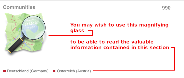
 well done … so I would just have to install uBlock Origin to make use of this …

 vs.
vs.