Thanks, it also only seem to work on desktop, not mobile. So check from your laptop!
So in a nutshell, it’s a style guide for how interface elements should look?
Seems like a very good idea to me
Thanks, it also only seem to work on desktop, not mobile. So check from your laptop!
So in a nutshell, it’s a style guide for how interface elements should look?
Seems like a very good idea to me
I think the main problem here has been the way Atlas has been presented. The initial post reads like a fluff announcement for people who are already deeply involved with Atlas, full of platitudes, but with litte substance explaining what Atlas actually is.
Anyone who wasn’t already familiar with Atlas before this post won’t actually know any more about it than they did before or why they should care about it. The main takeaway is someone promising the world in grandiose terms, but not how they are planning on doing that or why everyone else should be interested in it.
Even if someone wants to look deeper into the project beyond just this announcement, it’s hard to find any information about the technical substance behind it. References to further documentation and examples are either outright missing, drowned in a wall of text, or lead to websites that are no longer functional.
It’s only natural and understandable that the discussion and criticism here in this thread mainly focuses on that and not on any technical merits that the project may or may not have, simply because there is little to talk about in that regard.
Being new to the community has little to do with it, aside from the fact that having a track record of past community interactions and contributions can help to establish the context of what is being presented and how the project will be handled and managed going from here.
This explanation should have been in the first paragraphs of the announcement, not in post #62 of this thread.
An incomplete list of things that I would expect from an announcement like this and think could be improved here:
Keep it succinct. Avoid feel-good fluff language that only increases the word count but does not contain any actual information.
Aside from making the post unnecessarily long and harder to read, rambling about vague concepts and promises can make what you are saying seem less genuine and can detract from the actual substance.
Introduce and summarize the most important points first, expand on them later if necessary. The gist of what you are proposing should be clear after the first few paragraphs.
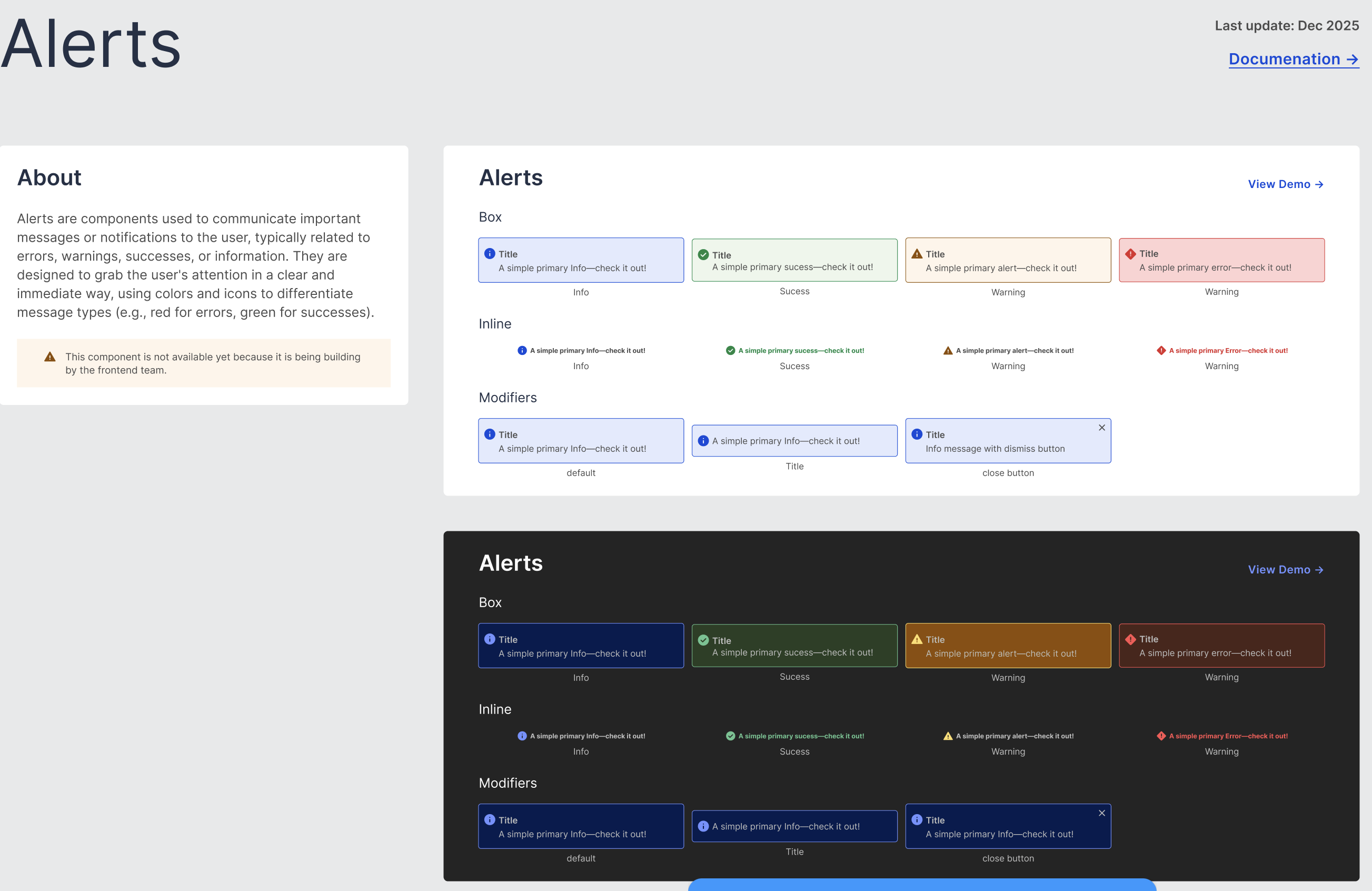
Show concrete examples and explain potential use cases. Include representative screenshots and provide showcases where people can discover the new tools and features you are presenting.
Know your audience. People here are going to be quite familiar with OpenStreetMap. There is no need to explain why OSM is important or why people should care about it, everyone presumably already knows that.
People here in this forum are generally not going to be UI/UX design experts and are unlikely to be familiar with jargon like e.g. ‘design tokens’. Terms like that require some explanation for laypeople. That is already being done to some extent in the longer OSM diary post, but maybe consider flipping that around. Explain the concept first in a few easily understandable words, then introduce the technical terms if necessary.
Manage expectations. Clarify the scope of what you are proposing and avoid overly optimistic promises that may not be entirely in your hands to fulfill.
E.g.:
"Atlas will be the design system of OpenStreetMap""Atlas aims to be the design system of OpenStreetMap"Ok, I’ll take that into account
but if I understood correctly, was this whole discussion carried out without anyone actually reading the diary post?
Is there a licence for all that somewhere? Are you ready to allow others to use that?
I don’t know Figma, so excuse me if it’s obvious to the Figma profis.
I’m not sure how to work with the Figma stuff. Have you considered sending pull requests to various OSM projects refactoring it to match your Atlas system? Someone did that for WaterwayMap.Org and I was very thankful. It might help you get mindshare. ![]()
I assume most people that have been involved in the discussion here have seen it (participants in the discussion regularly reference it), but I also think the diary post is unfortunately suffering from most of the same problems as this forum announcement post. All the issues I’ve listed concern both this forum announcement post and the diary entry together.
I wouldn’t entirely be surprised if a few people missed the diary post however. The forum announcement post doesn’t really direct people to it in any way and there’s no indication that people should go there to find the full story. The forum post could easily be taken to be the ‘main’ announcement. Since the forum post contains essentially no information about the project, people don’t even know why they should click through to the full diary entry post.
If the diary entry is intended to be the main point of this announcement, it should be near the top of the announcement post and prominently referenced in the text, not haphazardly added to the end of the post where it can be relatively easily overlooked.
We’re looking into that.
Yes, I can create a wireframe for your project. When I have some time, I’d also like to learn more about WaterwayMap so I can contribute.
Regarding the licensing issue, I’m currently working on it with the team and evaluating the best way to properly credit the work done by the Wikimedia contributors.
I also share the view that seeing OSM purely as a database is quite limiting. It reduces the map to something technical and devoid of context, when in fact it’s a rich and collective social construct.
As for the icons, I apologize, it wasn’t our intention to use those from the “Big G,” but they were the most readily available option at the time. We considered using Font Awesome, but the free version has limitations, and the icon set doesn’t fully meet our needs. In the future, we plan to create our own icon set, more tailored to OSM’s identity and unique requirements.
Thanks again for the feedback! At the moment, we have only a few developers, but we hope to be able to contribute more actively with pull requests soon.
I’m glad to hear your feedback! We will likely follow the same licenses currently used in Codex: Creative Commons CC BY 4.0 for the Figma files and GPL v2 for the code.
This should ensure compatibility with OSM projects and allow others to contribute, reuse, and adapt the design elements freely. Thank you for pointing that out, it’s truly essential that the project remains open and accessible to the entire community!
As many others have mentioned, undertaking a project like this is just as much (if not more) political and social as it is technical (or in this case, designical(?)).
Not having read every single word here, nor in all the linked resources, but to me it seems like you’ve already made two grave transgressions in the open source world (luckily both can be undone, but step one to that is understanding and admitting this, which you have so far not really done):
1 - Expecting things from others: This ^, coupled with other things you’ve said, makes it seem very much like your expectation is that once you’ve produced this design system, all the maintainers of all the projects will be incredibly grateful and jump right at implementing them in their projects.
In open source you should never ever put expectations upon anyone else than yourself. Others have pointed out that you can’t order someone to do something unless you pay them, I’d like to take that one step further and argue that you shouldn’t even expect anything unless you pay someone.
2 - Starting big: Getting someplace in any community (it’s currently being argued if OSM is a database or a map; I’d like to throw it foremost being a community into the bucket as well) takes time, mostly because of having to build trust (and while trust in technical or design competence is relatively easy to build, trust in “sticking around” takes much longer). At the same time, people with a lot of influence/trust/etc. are usually also the role models others look up to, so it’s naturally common for newcomers (as well as those having hung around for longer but without making a lot of noise) to strive to reach their status (they also weren’t around to see what it took for those with high influence today to get there). And just as naturally it might seem that the best way to reach big status is by making a big splash - the bigger the better. Obviously doing a lot of tiny splashes won’t take you anywhere, or at least take forever, right?
But that ignores that to make a big splash, you need trust. You need connections. You need influence.
And the amazing part (or in some cases sad for those who don’t get it) is that it’s actually quite achievable to raise in the “ranks”. But that takes both time (think a few years, but nothing crazy if you consistently deliver in that time) and producing value. Based on the history of that Github repo, you’ve been working on this for over 2 years. I can almost guarantee that if you’d have split your time between doing work that goes into existing projects in the ecosystem and working on the design system during that time, you’d be in a significantly different place now, both in terms of trust/influence in the community (and thus in the kinds of responses you’re getting), but also understanding of what needs to be done and actually already having achieved some of it.
So if you want this to get somewhere (and honestly, I wouldn’t mind if it does, while I don’t think osm.org/iD are that bad in terms of design there definitely is room for improvement, and even more so in some other OSM related sites); start small, and be ready to do some of the work yourself.
You could for example start by improving a small part of osm.org (or iD, or the Wiki, or…); say the structure of the login screen (not saying that it’s the most low hanging fruit, just to have an example). Don’t touch colors, borders, fonts or anything like that, just the structure of that single screen. Adapt it according to how you think it would have the best UI/UX. Create a PR with before and after screenshots and an explanation why it’s better. Don’t do anything else. Just that PR should provide a small, incremental improvement, that makes OSM a tiny bit better. Maybe it’ll lead to the full vision of the design system being implemented, maybe it stays at the structure of that single screen, maybe something inbetween. Handle feedback etc., and once merged, move on to the next part and keep repeating. For each small improvement the maintainers will grow increasingly confident in your work, which at some point might have built enough trust to do something more drastic like changing the color palette.
Why so slow? Because osm.org and iD are “core software” of OSM. This means that the maintainers are rightly conservative in any changes. The more central (or “core”) any piece of software/service/functionality is to an organisation/community, the less open it will be to modification - there is a significantly higher bar to clear if you want to change the API (which almost everything i OSM-world depends on) than if you want to change most text on the Wiki for example.
That however opens up another potential avenue to get your ideas to reality - instead of focusing on the relatively core components osm.org and iD, try working with some other tool that’s further removed from being “core” (List of OSM-based services - OpenStreetMap Wiki could give you some inspiration, ideally you want projects that can be expected to have a low bar to clear (relatively few users, not critical to anyone), that will get a big value from your improvement (i.e. those UI/UX is bad today) while also having maintainers that are at least sufficiently active to approve and deploy your changes). That way you may even be able to apply your entire design system to the projects you tackle this way. And again, each successfully implemented projects builds on your track recording which makes it easier to pitch your changes to “bigger” projects. If you can get enough of the services in the community to use your design system that’d suddenly be a very good argument to apply the same to osm.org/iD/etc.
Thank you, we’ll take your suggestions into consideration, Maybe starting with a smaller and more peripheral project might really help us.
I thought about what you said, and I say “no”.
Much easier when people are direct and don’t write a long post just to justify themselves.
I’m eager to see how you plan to maintain and synchronize all the mostly non-trivial Atlas ports needed across the different stacks you’re targeting, most of which won’t use Svelte.
I want to be able to use it, but integration doesn’t yet seem trivial.
Here’s a link to my talk from SotM-EU 2023 “Maintaining OpenStreetMap” - https://www.youtube.com/watch?v=99_ecrNOMPs
Yes, unfortunately I couldn’t give my SotM-EU 2024 talk in person, but I recorded it at home. Here’s a link to that one: “What’s New With Our Website”: https://vimeo.com/manage/videos/990974285 . Paul was close with his estimates, the stats were that in the 12 months to July 2024 there were 1717 commits across 571 merged pull requests.
I hope watching both videos helps spread more detailed awareness as to what’s going on with the website development, although two short presentations aren’t likely to answer every individual question.
(let me preface this by noting that I want to provide constructive critisim here, and not to be dismissive of a project – as to make any decision about the value of the proposal, I first would have to have at least some idea of what it is actually about and what it is its scope, and I’m utterly failing there)
According to Discourse, at least[1] 184 people attempted to read it (i.e. clicked on the link). And according to the posts I’ve read, less than half a dozen people managed to both read it and actually understand it.
Such low comprehension ratio suggest it could/should be improved dramatically.
Here are few of my thoughts how it could be improved:
good part of that diary post it seems to be written by some LLM. It might look visually nice like proper English, and might even be understandable to the person who asked AI to write it, but it is likely utterly incomprehensible to most everyone else (esp. non-designers). You should try to avoid that.
Random example from the diary:
A well-designed system makes it easier to scale products and features while ensuring that new components and designs are seamlessly integrated. It offers flexibility for customization while maintaining consistency, enabling teams to work efficiently on a variety of projects.
Ummm. Yeah. Is there some information hidden there? What is it about? To me as a techie, it sounds to be some incomprehensible management content-free newspeak devoid of all actual meaning. E.g. like something generated by Free Business Jargon Generator [Unlimited & No Login] – Feedough, like this:
“By harnessing the power of collaborative innovation and leveraging data-driven insights, we can elevate our sales strategy to new heights, transforming challenges into opportunities and ensuring that every team member is empowered to drive sustainable growth and exceed customer expectations.”
Both are equally unreadable and pointless to me. I’d literally rather (and easier) read Privacy Policy & ToS of Amazon. Maybe it’s because I’m not a designer, dunno. But many people here are likely not designers too, so tailoring a speech to them would be worthwhile IMHO.
Unfortunately I do not know good LLM prompts to accomplish that, it’s not my forte. Perhaps something along the lines “be succinct, short and clear, avoid any marketing speak, describe the project in two paragraphs at the most, while avoiding using any fancy designer words”? But I’d actually suggest writing the text yourself even (or especially) if your English is not that good, as that usually works pretty well as self-restraint for trying to embellish it too much with fancy meaningless but uplifting phrases.
I’d suggest making it much shorter, and actually quickly showing what it is about. Since it seems to be in the area of “design” (to the best of my understanding), how about doing things which web designers do to their layman customers when they try to make a deal?
In particular, few simple mockups. I.e. the whole of the post perhaps could have been: “Hi, we would like to improve design of the www.openstreetmap.org to be more consistent / in better colors / use more readable font / whatever; here are 5 screenshots of existing screens and here are 5 mockups of our proposed improvements. What do you think? Should we continue in that direction and create PR to improve those HTML/CSS/sprites/whatever, and create a short document for further designers outlining how to keep their future changes consistent with existing style we’ve presented here?”
…and then add a single sentence to each mockup explaining WHAT is changed on it (not everyone is expert in “Where’s Waldo”) and WHY (e.g. we made better contrasted colors here to comply with WCAG2.2 and to improve accessibility for visually impaired people; here we made consistent spacing on all pages; here we made this page reachable in 2 instead of 4 clicks while also being easier to find and with clearer wording, etc).
That (at least so it seems to me) would IMHO be infinitely more understandable, much easier to write[2], significantly more considerate of everyone’s time and efforts[3], and easy to package into smaller, easily understandable PR which could be more easily and much quickly merged by the appropriate OSM project.
to emphasize, it’s best to make each suggestion short and simple. Then it is much easier and faster to understand it, evaluate it, and merge it. And then you repeat it 100 times for other 100 improvements. E.g. one PR to fix spacings to be consistent and readable. Another one to use contrasted colors. Another one to change top bar navigation. Etc. As the saying goes: “How do you eat an elephant? One bite at a time”. Trying to do all at once will likely inevitably end up being mighty hard to swallow.
Again, just my opinion and a friendly suggestion. Hope it helps.
probably more, as Discourse does not seem to count open-in-new-window actions, but only direct clicks ↩︎
well, unless you let LLM write it for you, but as we can see, that doesn’t work all that well ↩︎
always remember that it is not just you which had to write it, but people many more people also have to read that – so 1 minute you could save each of them, is easily worth your 15+ minutes of considering how to do it ↩︎
I’ve never linked to YouTube here before, but Weird Al Yankovic wrote a song about such “corporate speak,” in the form of not only both the music with lyrics, but also with some of the best whiteboard drawing you’ll ever see animated on a music video.
")
Enjoy.
Thanks, Steve!
Never saw that one before, but it’s now saved! ![]()
I’d also (similar to @Matija_Nalis) like to emphasize that I am not disparaging the OP (as I offer Weird Al for some levity and perspective, a version of “wrong message, wrong audience”). I do note (along with others) that in a worldwide project — even one that is keen to always be improving ourselves — with all the language, technology, cultural, and other potential barriers, OSM always stays open to new ideas. Even as it seems like there are high ladders to climb to be excellent with something new, because, there are such heights to scale in our project — we set high standards for ourselves.
While early sketches (now) like Atlas (and NG) actually take shape and get vetted in the real, live “firing zone” of our critiques in forums like this (again, meant to be constructive), no ill will is meant. What is meant is to help the OP sharpen ideas so they fit and interface with our large, “we’re already good, show us specifically how we can be better” audience. That’s OSM; we can be a tough crowd.
Language, cultural, technological rough edges are to be expected, but I (we) truly have seen big improvements over the decades. Strap in for a long road ahead, as doing what you are suggesting takes both years in real time and years of patience by others in OSM, which some are offering you and some are not. OSM is the real world and while some of us both mean to be helpful and are helpful, not everybody is going to be specifically helpful to you. Part of Atlas’ success (should it find success) is finding “your own way through.” Listening skills are super important. Atlas better reflects the actual needs of OSM only to the extent Atlas actively listens to OSM. Only then might it become a real, working part of OSM. One step at a time: such endeavors are neither quick nor easy. Again, good luck.
Hi @Gustavo22Soares,
Firstly, I would like to thank you for presenting us the idea of having a consistent design for OSM. I am an amateur enthusiast of interface design, and I also find that OSM lacks consistency, style, and graphic guidelines (like too much FOSS). That is why it is great to have ideas and present them here !
Also, I had seen the visual to improve the OSM profile (Reimagining the OSM.org), but I didn’t know it was you, that’s a good vision. I’m delighted that the Microsoft team has taken up your idea Updates on 2025 infrastructure development plans - Microsoft presentation.
Furthermore, I agree with some of the things that have been said, in particular:
However, I didn’t understand why there were so few visuals and so much text when looking at the old presentation page for the Wikimedia design system (Design.wikimedia.org/style-guide), it’s very clear and limpid, with a small amount of text that is often illustrated. I think that’s the direction to take.
When I look at your diary : Gustavo22Soares's Diary | Why are we creating a design system for OSM? | OpenStreetMap, I understand that you want design consistency, but I think you would benefit from illustrating and explaining what you want to do with these visuals.
Furthermore, I was surprised to see this project come “out of nowhere”, because this is a subject (“design”) that has my heightened attention. I had never heard of it before, even though I am active in many community spaces (the Forum, Discord, the Wiki, Telegram, etc.). Where did the discussions take place beforehand to prepare for this project, and where are they taking place now?
In addition, I think that in a community that is attentive to the tools it uses, it is better to use free alternatives. Fortunately, there is a very good one at Figma: it’s Penpot !
I think that using this alternative would make it easier to include more people in this important change.