I downloaded changesets-230508.osm.bz2 from https://ftp5.gwdg.de/pub/misc/openstreetmap/planet.openstreetmap.org/planet/2023/:slight_smile:
curl https://ftp5.gwdg.de/pub/misc/openstreetmap/planet.openstreetmap.org/planet/2023/changesets-230508.osm.bz2 -o changesets-230508.osm.bz2
I wanted to see all the changesets mentioning mapillary. I restricted my search to changesets overlapping with the approximate bounding box of Norway:
osmium changeset-filter --bbox -10,57,34,81 --progress -f opl changesets-230508.osm.bz2 > changesets_filtered.txt
grep -i mapillary changesets_filtered.txt > changesets_mapillary.txt
(Here I’m heavily relying on this post and osmium documentation.)
To visualize how these changesets are distributed over time, I do:
import pandas as pd
import datetime
import matplotlib.pyplot as plt

df = pd.read_csv("changesets_mapillary.txt",sep=' ',header=None)
df = df.assign(ts = df[2].apply(lambda row: row[1:]))
df = df.assign(timestamps = df.ts.apply(lambda s: datetime.datetime.timestamp(pd.to_datetime(s))))

df.timestamps.hist(bins=100)
plt.axvline(x=1.66*10**9,c='r',alpha=0.8)
Giving me:
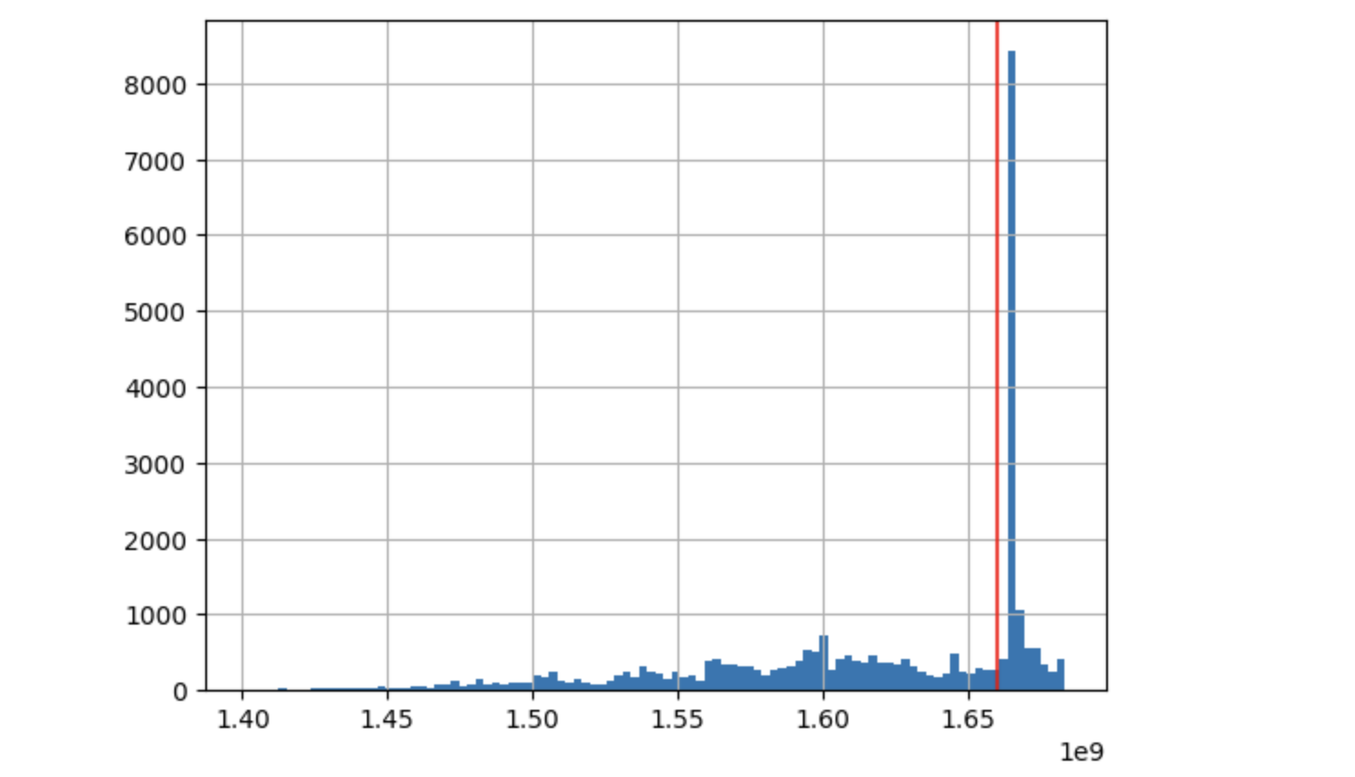
The horizontal axis is unix timestamp, the vertical axis is number of changesets. As one can see, there is a big spike slighlty after the red line.
To see how the timings of changesets are distributed over the course of a day, I do:
datetime_series = pd.to_datetime(df.timestamps, unit='s')
(datetime_series.dt.hour*60+datetime_series.dt.minute).hist(bins=int(24*60))
plt.xlim([0,24*60])
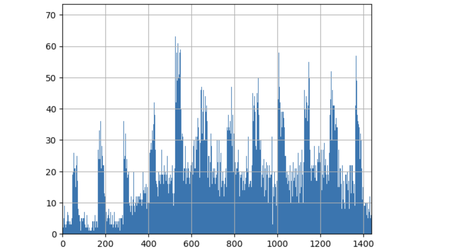
(Horizontal axis: quarter hour within a day, vertical axis: how many changesets originating from that quarter.)
There is a strong 2-hour periodic signal present. To see if this is the same signal as the spike above, I consider only the changesets before the red line from the first image, and replot this second distribution:
datetime_series = pd.to_datetime(df.timestamps[df.timestamps<1.66*10**9], unit='s')
(datetime_series.dt.hour*60+datetime_series.dt.minute).hist(bins=int(24*60))
plt.xlim([0,24*60])

Clearly, the 2-hour signal disappeared. I replot the first plot, but now I zoom to the spike:
lower = 1.66557*10**9
upper = 1.66625*10**9

plt.figure(figsize=(10,5))
df.timestamps[(df.timestamps>lower) & (df.timestamps<upper)].hist(bins=500)
plt.xlim([lower,upper])
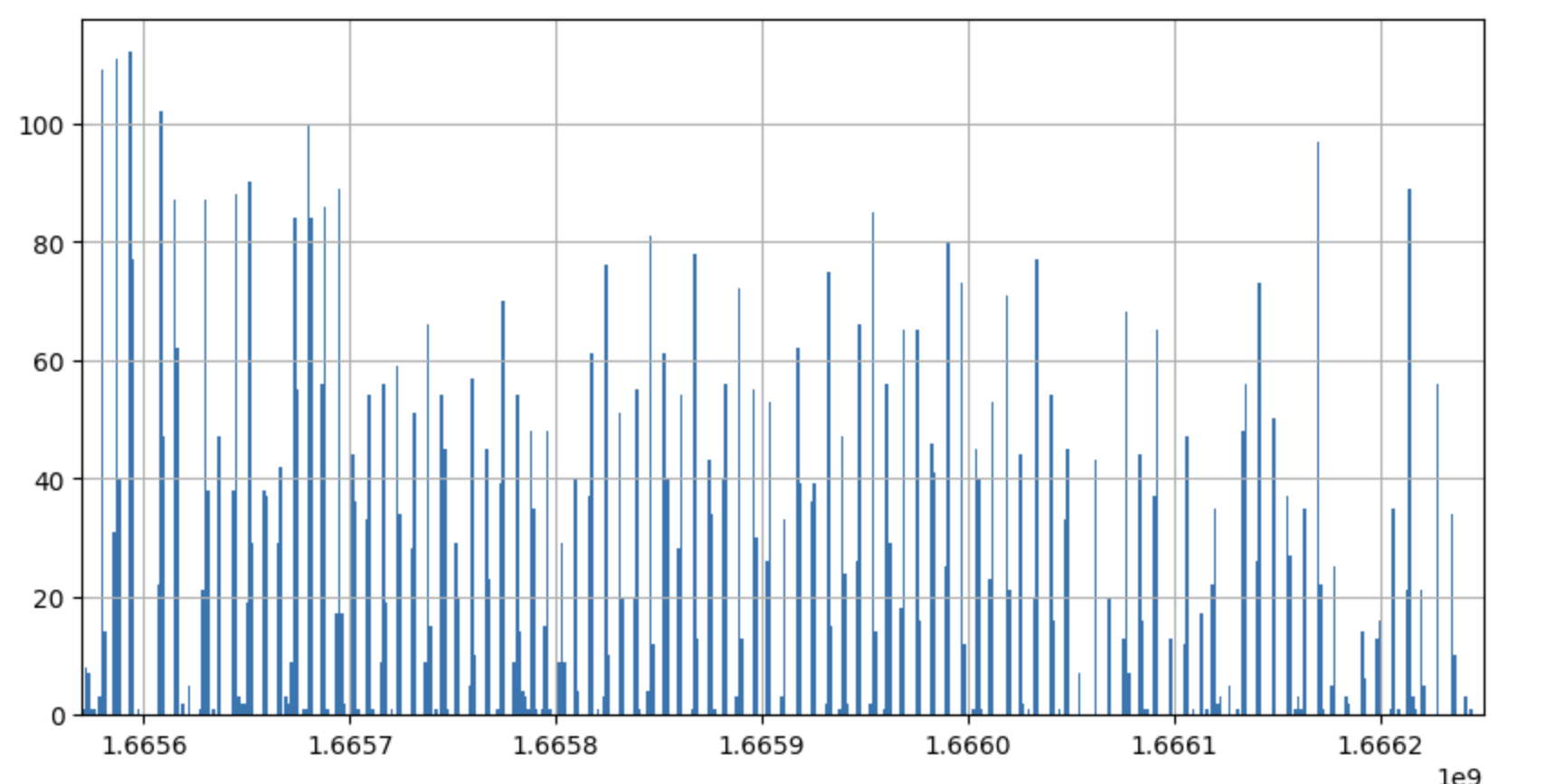
As expected, a seemingly periodic signal. Let’s try to fold it with a 2-hour period:
(df.timestamps[(df.timestamps>lower) & (df.timestamps<upper)]%(120*60)).hist(bins=120)
Result:
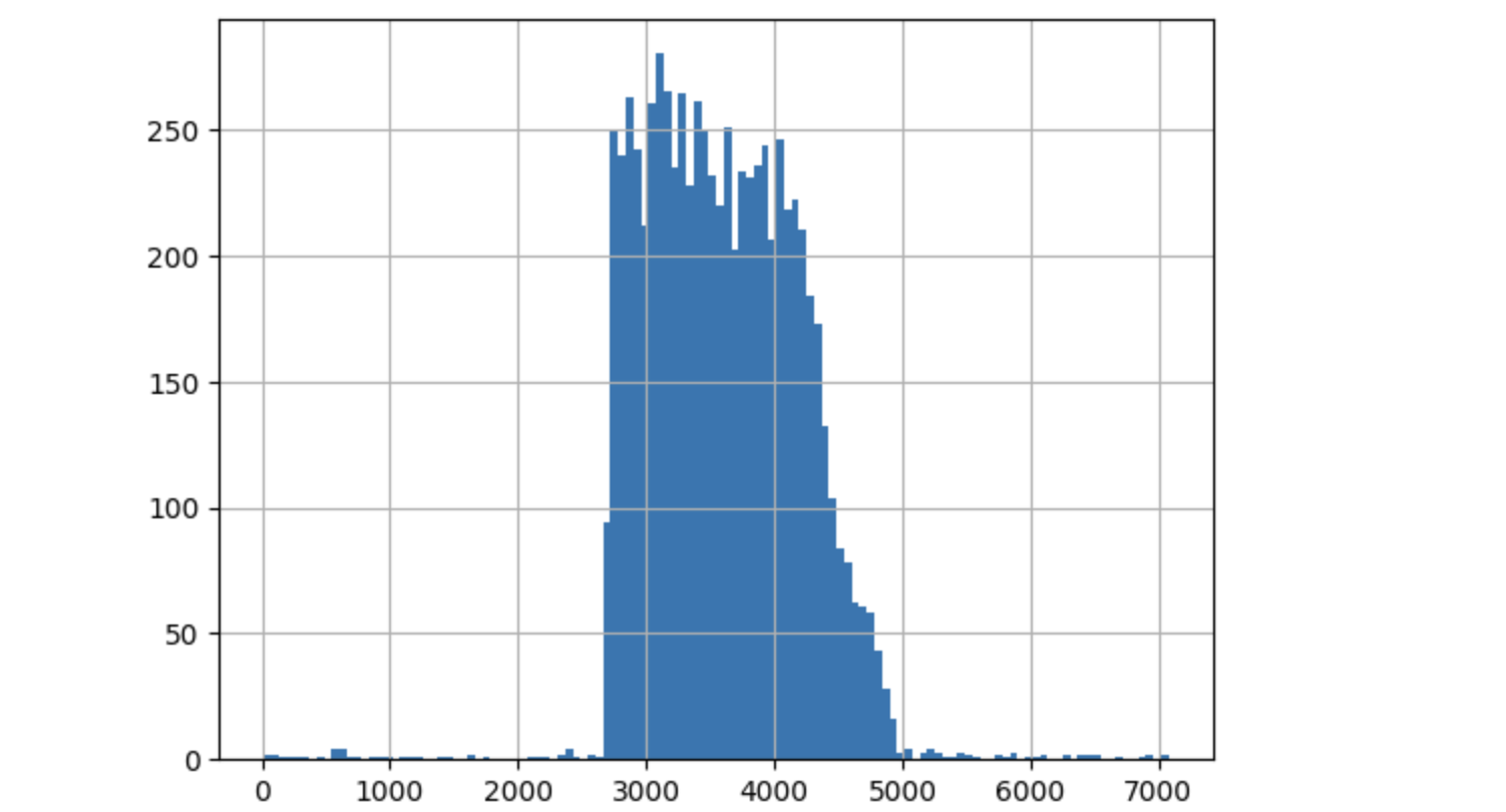
I believe this demonstrates that there is a strong 2-hour periodic signal between lower and upper. What do lower and upper and upper actually mean?
print(pd.Timestamp(lower,unit='s').strftime('%Y-%m-%d %H:%M:%S'))
print(pd.Timestamp(upper,unit='s').strftime('%Y-%m-%d %H:%M:%S'))
I get:
2022-10-12 10:20:00
2022-10-20 07:13:20
I don’t know what’s behind this observation. Hence, the question:
What happened between 12 Oct 2022 10am and 20 Oct 2022 07am, roughly every two hours, with mapillary-sourced features?