Is it possible to change favicon to something diffrent from osm.org? I lack graphic skills to propose any, but it’s really confusing to me looking at list of open tabs in my browser (and I believe I’m not the only one).
Hello and thanks for the request.
Is there any design trend other OSM sites have been using? Are there other OSM sites examples that you think did a good job at this?
Cheers.
I personally like idea of modifying magnifying glass from OSM logo. OSM Wiki (however not using it as a favicon) may be an example.

Typical for me may be
book icon

or
people icon
![]()
inside glass, instead of default binary (or “Wiki” in Wiki); or instead of whole magnifying glass.
Icon already used in General Talk section may also fit IMHO.

I wonder if a change this small would be visible on a 32x32 (or even 16x16) favicon 
I share your doubts - modifying something within the OSM magnifying glass would hardly be recognizable in the favicon size and probably make a physical magnifiying glass necessary. If you are looking for clearly distinguishable favicons for your browser tabs you would need something entirely different in my opinion.
If you want to stick to the OSM magnifying glass probably different colour backgrounds could be a solution?
Anyhow for me this would not make too much sense, I am quite happy with the same favicon for all different OSM-related browser tabs.
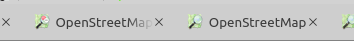
This is how the general talk icon would look like in this context:
![]()
Subtle, but different enough to be distinguishable if you’re familiar with the difference.
It does have the benefit of being already available (seeing how I also lack the graphics skills to make something better) and still being clearly recognizable as related to OpenStreetMap.
3 Likes
Worth do some testing since this is a quick switch over the options. If you reload from cache you should see the difference.
@kubahahaha would that work for your?
2 Likes
A fast and simple solution … well done. From my point of view it does not make much sense anyhow, in the resolution I am using on my screen it looks like a flyspeck on the browser tab. 
For me it’s just ok - still recognizable as OSM reference, but easy to distinguish from main OSM site.
I am 100% satisfied with that change, as title is exactly the same, that small orange dot makes it more readable for me.
Not marking as solved yet, maybe other users have some concerns.
4 Likes
On a 16², it is not recognizable as talk bubbles, but it is clearly distinguishable from the main site favicon. Doing better will be very hard.