I think it is a good idea indeed. The Wiki page of railway=station says the following:
railway=station should be tagged as a node, placed at the centre of the station from the passengers’ point of view (i.e. near platforms), or as an area covering the whole station.
And the Wiki page of public_transport=station says:
A station will normally have some, but not all of the following attributes:
Have a physical presence consisting of a building or other structure […]
Have a number of platforms and stop positions […]
[…]
Have amenities for waiting passengers including shops, vending machines and information services and possibly car parking […]
[…]
The station itself is mapped as an area, usually covering the outline described above […]
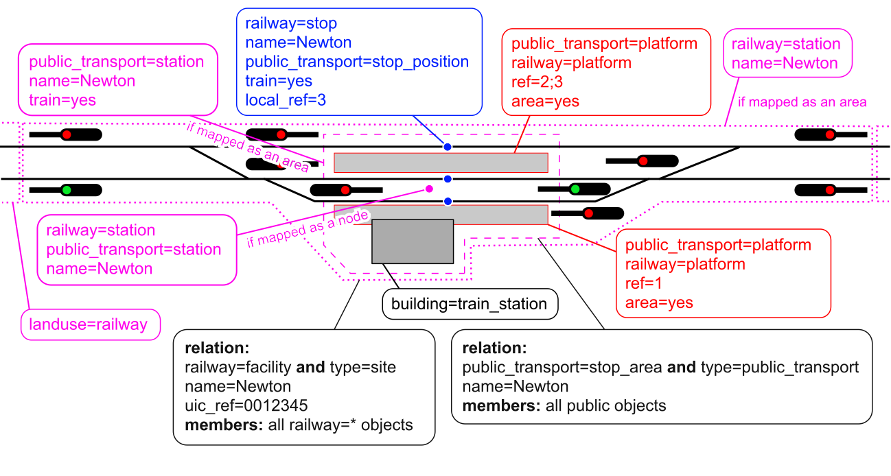
So railway=station should cover the whole station (from a railway infrastructure perspective), but public_transport=station should only cover the public area of the railway operating site.
I agree, but train=yes applied on the same area as public_transport=station is could indicate that it’s a railway public transport station.
My bad, sorry, I didn’t understand it at first! Good idea—I agree that a label member of the relation should be used to render the station marker at the correct location.
type=site seems like a good idea to me, it fits the purpose! I wouldn’t choose type=railway because it’s unnecessarily specific next to the railway=facility tag.
Who suggested using railway=facility on the same relation as type=public_transport?
But I see your point about mixing public and private use objects of a railway operating site. What about using public_transport=stop_area with type=public_transport for the public part (public use objects added to the relation as members), and railway=facility with type=site for the whole area (all objects added to the relation as members) of the station?
I don’t know and want to ask how were railway=facility and railway=site discussed and created in OpenRailwayMap too. I don’t understand their thinking.
…but no questions were asked about railway=facility or railway=site yet, so we might ask: @rurseekatze, could you please tell us your thought process on these tags (and also your opinion on the things above) now? Thank you in advance!
There is a lot to take in looking at that diagram, and it is hard to follow which combinations are valid. Would it be easier to have two diagrams, either:
mapped mainly as nodes v full area mapping, or
station with public transport v non public.
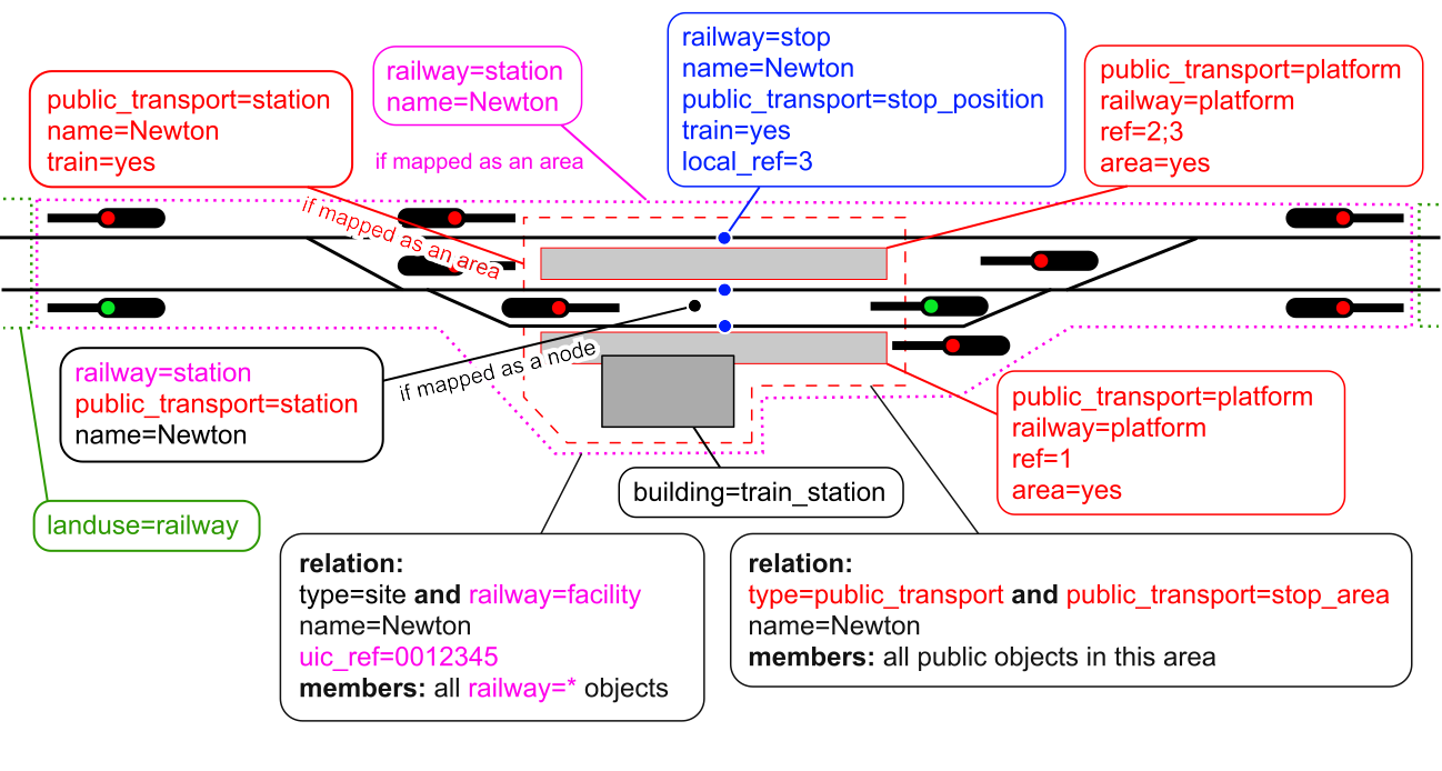
It is not clear from the diagram what railway=facility represents - as shown it appears to be redundant with railway=station, as all the members of railway=facility seem to be inside the railway=station area. Or is railway=facility meant to be used when railway=station is a node?
Minor points (and I realise these are probably inherited from earlier versions) : Is there any significance to showing ref= on platforms but local_ref on stop positions? Or to showing name= on stop positions but not on platforms?
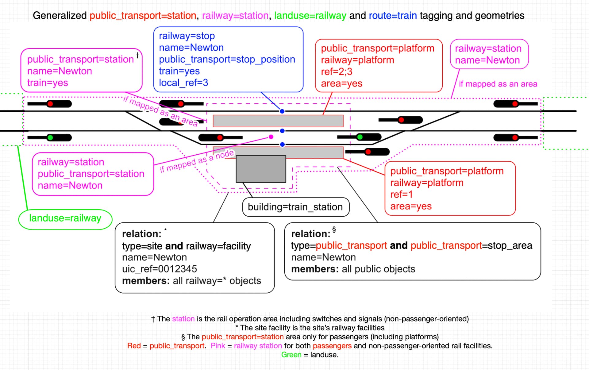
As a long-time (14 years) OSM rail mapper, I rather like @gymate’s diagram, though I agree it is fairly complex for beginner-level mappers. It could suffice for advanced mappers who know rail mapping in OSM well, but for beginners, I’d like to see (here, please) what two diagrams that are nearly identical, but one without relations and areas (which could suffice for our “simple railway station” diagram) and the one above, with relations (as more comprehensive, but no longer really “simple”). Also, maybe “mapped mainly as nodes” vs. not. Somewhere, it should be made clear that some elements are optional and some elements do not apply to “not public_transport” flavored stations. The use of color is good, perhaps this can be extended (for optional elements) with additional colors.
I’d make two small tweaks: for both relations, swap the order of type and its first-line companion so that type=site and type-=public_transport come first. (Because a relation’s type is primary in defining what the relation is). Other than that, IMO it’s an excellent diagram, though, it is no longer “simple.” Maybe for the full, comprehensive diagram, we change the word to “generalized.”
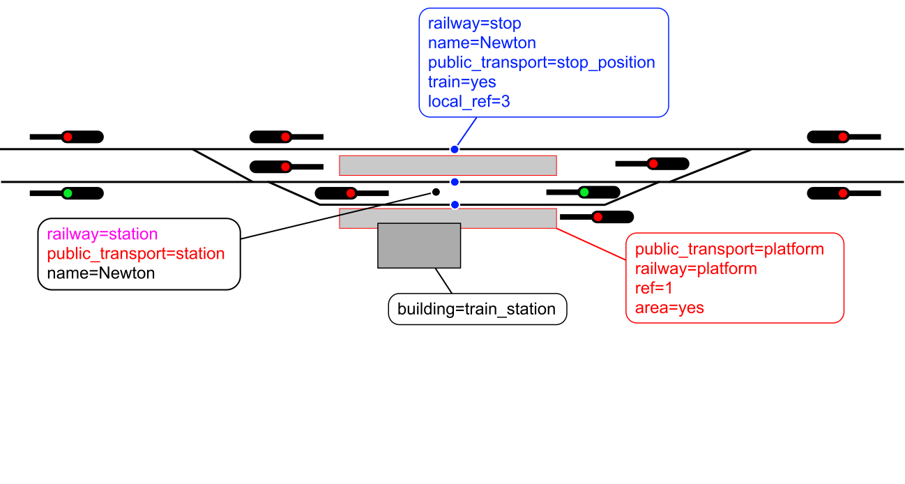
type=site + railway=facility for including all rail operation devices is the counterpart to type=public_transport + public_transport=stop_area which includes all public-related features of the station. The railway=station area is the rail operation area of the station (including switches and signals), while public_transport=station area cover only the passenger area with platforms. If the station is not public for passengers, the railway=station becomes railway==service_station, =yard, or something else. railway=stop + name= + ref= is representing the stop on the track in the network, so local_ref= is used for the track/platform number of this stop in the station. This is similar to highway=bus_stop , with the difference in whether they are combined with public_transport==stop_position or =platform . platform= is considered to be associated with the stop and station. The ref= reflects this local standing.
The practical reason is train stops and bus stops in reality usually get a unique code, and identifiable name in the network level. Platforms don’t, and are only relevant inside the station.
This is a rough-cut and should not be used as-is, as it has hatch marks from my sketch software and my roundrect in green is not “the” roundrect (shape). But I try to be more explicit with color, add notes from @Kovoschiz and “it is getting closer.” So, @gymate, if you want to build from here or wait for further input, at least here is one more nudge towards a finish line:
Really, everyone, we’re nudging here. It’s all chalk and watercolor now, so please touch-up (or even slop on some new paint wholesale) what needs doing. And oops, I see I should have chopped a few more pixels off the right-side edge. But you all get my ideas / suggestions here, I take it.
Edit: 3rd footnote (§) might have its public_transport=station text be pink, not red; I think so, not sure.
I think perhaps the box for public_transport=station mapped as an area should be red? And ideally the box where public_transport=station and railway=station are together (for mapping as nodes) would somehow show both red and pink.
I am still unsure what the railway=facility adds on top of railway=station if the latter is proposed to include non passenger facilities. I suppose I don’t fully understand stop_area either. My interpretation of stop_area is that it is important because the station is usually a node, so there is no spatial relationship between platforms/stops and a station (or each other). Would it be fair to say that if all railway=station and public_transport=station were mapped as areas, we wouldn’t need either stop_area or facility relations? Or do they serve some other purpose I am missing?
Yes, another “wobbler” I wasn’t sure whether should be pink or red, but red seems more correct for the color of the box, the color of the text and the color of the dashed-line geographic extent around the public_transport=station (if mapped as an area).
I don’t know how to visually convey the combining you suggest for stations (station elements of a relation tagged type=public_transport AND railway=station as a node), especially “both red and pink,” but I do see why you might want to do that. However, I’m not sure it’s a good idea, as while these are both (named) stations, they really are fundamentally different things (one is for passengers, the other is for passengers + rail infrastructure like signals).
Your second paragraph I will leave for others to address, while I thank you for adding it.
Also, the “Green = landuse” line should additionally convey “Blue = route=train relation elements.”
it looks quite good and the colors work to make the thematic grouping easier to understand, still I think it would be even more understandable if the same tagging (as node and area) would have the boxes directly adjacent (e.g. railway=station mapped as node and way is on opposite sides of the diagram, would better be close to each other).
The idea to have 2 diagrams, a “mapped-as-node” and “mapped-as-polygon” version, also sounds interesting to me, although I think it isn’t obligatory and could be understood with everything in a single diagram as well.
Yes, they do serve a purpose. In short: railway operation related objects in a railway operating site are only a subset of all objects that a railway=station area covers, not to mention multilevel stations. (The same analogy applies to public_transport=station.)
We talked about it (among others) here, here and here in more detail.
I didn’t add the title and footnotes in this illustration because I think it’s the Wiki page’s job to explain the tagging scheme, the illustration only extends that. (I also intend to edit the Wiki page accordingly.) And I think that colors don’t really need an explanation on the illustration as they’re just visual guides for grouping tag categories, but they could be featured on the Wiki file page.
Lookin’ really nice. Offering a thumbs up to both of these diagrams, though if others want more or different, I remain listening.
Edit: If I may offer an “editorial preference” of mine, let’s call it, when presenting these graphics in our wiki: the simple one first, then some text, then the “generalized” (more comprehensive) graphic secondly.
It’s pretty neat how the “a picture says a thousand words” adage conveys to our minds in this case. Again, the colors as semantics are a little fuzzy between red and pink, and I hope it is made clear somewhere that blue is for route=train relation elements, but yes, the colors now better carry a nice load visually.
First graphic becomes a newer “simple railway station as a node.” Many, even novice mappers, with a once-through tutorial perhaps, can walk through this. The second graphic might be titled: “more generalized, with multiple themes” leaving this the wet paint that it is right now. I think only minor touch-ups ahead, but I could be wrong. I don’t think we need any wholesale reinvention of this wheel. I’d say we install these graphics in our wiki as their paint dries.
I offer claps on the back to all and sundry who accept claps on the back at a job well done.
One more bubble (roundrect, with black text and blue text) I think might properly finish this: could we add
relation: type=route and route=train
with relation: in bold black text and the rest in blue?
Right above the red public_transport=platform (etc) roundrect?
Could fit on a longish single line (“extending east of the red signal”), maybe better two lines of text (with a touch more vertical dimension) to remain consistent with the other two relations with similar notations (in bold). I lean towards a two-liner. It could also cleverly be tucked in at the bottom or far-left corner and maybe bottom. Do-able, but what do others think? This relation (route=train, and the way stops are tagged, and train=yes…) means we should say this explicitly somewhere, rather than implying it. And this format keeps it regular, and black and blue, making sense to me, at least, “completing the picture.” (Like 99 to 100%). “All the syntactic aspects are shown.”