If mapped using the tourism=information rubric I’d probably use board or map as the information tag. I’m fairly relaxed about using this scheme, but I think ultimately it would help to indicate the purpose of the information (e.g., hiking)
And I think that’s fine for the central board: the two side boards also have a strong aspect of advertising. There may be suitable tags in the advertising key as well.
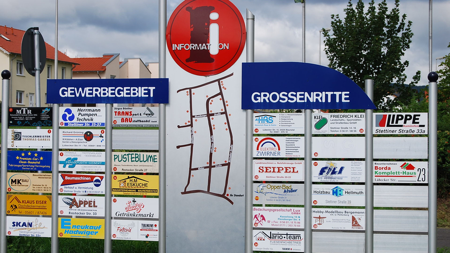
The more usual form I’ve seen is just a board with labels for each numbered unit, and presumably the buildings are numbered logically.
Some social housing estates in London have similar boards to help locate individual apartment blocks.
I don’t know how to tag the signpost, but If the you map in OSM every business with the info on that signpost, where the signpost is located is not needed, as you can locate the business using only OSM data, and not the signpost itself.
Because more often than not, they only contain direction hints and no map. And it’s hardly tourism information either. A tourism information board is something that informs about things about the region, interesting for tourism, not so much for commercial endeavours. information=board, is one reason why I was asking, but the Wikipedia page is not clear, and when it comes to tourism information, that seems least fitting according to the Wiki.
I respectfully disagree. If all the company names were of the same size in the same font then it might not be advertising, but in this case each placard for a company clearly uses the brand identity & other advertising type information. The purpose is not solely to indicate where they business is location, but clearly to make passers by aware that their business exists at all. In fact ‘totems’ with unified style often have this purpose too: they are often poorly located for the purposes of someone arriving at the industrial estate by car.
Maybe, but I see that all the spaces are the same size. Each business use their branding so it’s easy to their customers to find them, and then locate the number in the map. Also probably was made this way so the managers of the site can change the map easily if the business change, as they only have to make and install a small new part…
If instead of the small central map with reference placards at its sides, it was a big map of the same size and instead of numbers each location is showing using the brand, it would be more expensive to update the map.
Beside this, the title of the OP was “How to map guide maps and signs…” (bold are mine)
I was refering only to the picture you post. Not extrapolating to other.
In a wider meaning of tourist, as a person who is traveling in an unknown place, a visitor can be seen as a tourist that needs to know the info showed in the map?