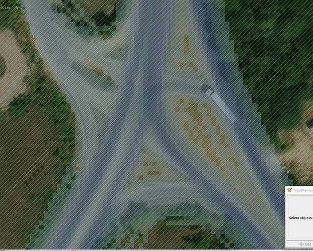
There is also this note for a road in northern of Quebec region were you automatically respond saying this is far from next village. In this area, this could be often the case and not much info about isolated areas. I did comment asking for precisions. Note: 4076672 | OpenStreetMap
Agree on that. If OSM community think, there should be a minimum length, this should be considered in the API while adding notes, not by a bot closing such notes.
Yet another amazing tool. The bus factor is ever increasing for OSMF! ![]()
Could I wish for the same username search as on the normal HDYC page? So I don’t need to find my UID. And also add it to the homepage of neis, since it’s so useful and beautiful!
And a question about the bot account: Is it responding with an LLM output, or is it all manual after the first interaction with a note? I think explaining more about how the processes work would clear up a lot of confusion.
Yes, I have seen this a few times. Usually it’s been a mapper who intends to come back and resolve their own notes (in which case the bot message will be annoying but not really impactful). Once or twice I’ve found older groups of notes where the address data had not been added.
Obviously a dedicated mobile mapping app like Every Door is more efficient , but not everyone knows about those or wants to use them.
You can directly access your OSM Notes page through HDYC. On HDYC, you will find a link under ‘OSM Notes.’ I would prefer not to include the username as a parameter in the URL.
So far, everything is manual after the initial interaction.
Otherwise, the bot and its processes were deactivated by me.
I left a corresponding entry on the user profile, NeisBot | OpenStreetMap
@pitscheplatsch Any reason for suddently stopping? Or have you gone though all “easy” duplicates and such?
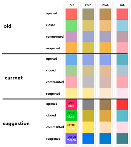
Also oh god what happened to the colours of “The OSM notes of Country”?! I don’t wanna come across as nagging, but why change it from logical colours to colours that carry no meaing? If it’s for accessibility reasons, could we not have that as an option and not the default?
The NeisBot account was my first attempt to semi-automate processes and gain experience with it. I was well aware in advance that this could or would be controversial.
There were at least three “complaints” directed at me. One of them is right at the top of this thread, or rather, this thread was started because of my account: “This is absolutely terrible …”. A second feedback can be found under the note also linked here “#BadBot #DontWasteHumansTime”. And thirdly, I received a PM from a highly respected person critically questioning the comments of users who had been banned.
Considering the total amount of NeisBot | OpenStreetMap activity, I personally would draw a positive balance for this account. Many of you probably know what else is (semi)automatically edited (or imported) every day and what goes wrong in the OSM world. Please, feel free to correct me if I am wrong here.
Yes, correct. Someone with red-green color blindness asked me to adjust the colors accordingly. Are the current colors okay for you? I made a slight adjustment here in the last few days.
Thanks Pascal!
Personally, I think the blue & green are very hard to separate, especially when criss-crossing over each other. Could the green possibly be made brighter, as in the “2 cases here” indicators at OpenStreetMap (OSM) notes ("add a note"-feature) for Australia @ ResultMaps.neis-one.org?
The blue is also rather murky, so it would be nice if it could also be a bit more distinctive, possibly like the unread “Latest Complete Log” title?
I’ve just quickly rebuilt the website using Chart.js. Personally, I much prefer the look and feel there. All the jQuery stuff has been removed. I think the graph looks much better now and should be easier for everyone to read. With a click on the legend, you can also show or hide the Open, Closed, or Total graph individually. Have fun.
My main problem is that they seem arbitrarily chosen. Red for created and green for closed makes sense when going through a “todo-list”. Blue feels like a modifier colour, maybe suitable for comments.
I’ve played around with the colours and to me, it looks like the current ones are better for some people and worse for some, but mostly due to the fact that the opened colour changed completely. It seems that making the red a pinker hue makes it stand out more from the green for the colour blind. The contrast of the text on top of the colour isn’t very good today and it wasn’t before either, but I don’t think it needs to be, since you quickly see what’s what anyways due to differnet word length and colours. Same goes for the colours as well, really, so it’s mainly in the diagram colour blindness needs to be taken into account. There the only important difference is between opened and closed, so I’ve tried increasing the difference while still keeping them red and green looking. Thoughts?
Omg I was just about to ask why the amplified chart was removed, and then you drop the bombshell that you can customise the chart! It certainly looks way better than the old one. Maybe some affordance for the customisation would be apt, though.
The only other thing I could wish for now is that it’s as wide as it was before the map was added, since it’s starting to get a bit crammed when the notes activities fluctuate wildly from month to month.
What’s the point of commenting on notes from MAPS.ME and OrganicMaps?
Clearly replying to an anonymous note expecting to get a reply from the note adder is unlikely to succeed ![]()
you never know ![]()
Usually nothing will happen, but I have already gotten replies from anonymous (although you cannot be sure they are the same).
This kind of note in my area is not very reliable, I guess they are sometimes confused about the side of the road where they are, or are even farther away and don’t realize the displayed device position is not accurate. Or want their competitors removed ![]()
Even if we ignore that this note is anonymous, it is still not clear why to comment on them. It already says that it means that the place doesn’t exist. These notes are always located in the center of the POI.
the useful part of the comment is that it identifies an OpenStreetMap object.
Please just take a look at the note already linked ![]()
At least one (MapsMe) note less?
just open the iD
The problem is that there are thousands of similar notes. For example, a few months ago, I counted a couple of thousand only in Russia, creating a MapRoulette challenge for notes about closed POIs MapRoulette
To reduce the number of such notes, you don’t need to write comments on each of them. You can just solve them. But it takes a lot of people to do it.
Now the comment will also be sent to the user who left the note. What for? And so it’s clear what he wanted to write.
The right directions here are:
- Provide a tool for quickly deleting objects that are reported in notes
- Contact MM/OM developers to have their apps remove POIs themselves.

